
Bureau Doorbraak
For Michiel Smit
Visual identity for a creative construction supervisor and interior designer.
For Michiel Smit
Visual identity for a creative construction supervisor and interior designer.


The main color blue of the identity refers to the architectural history of the blueprint


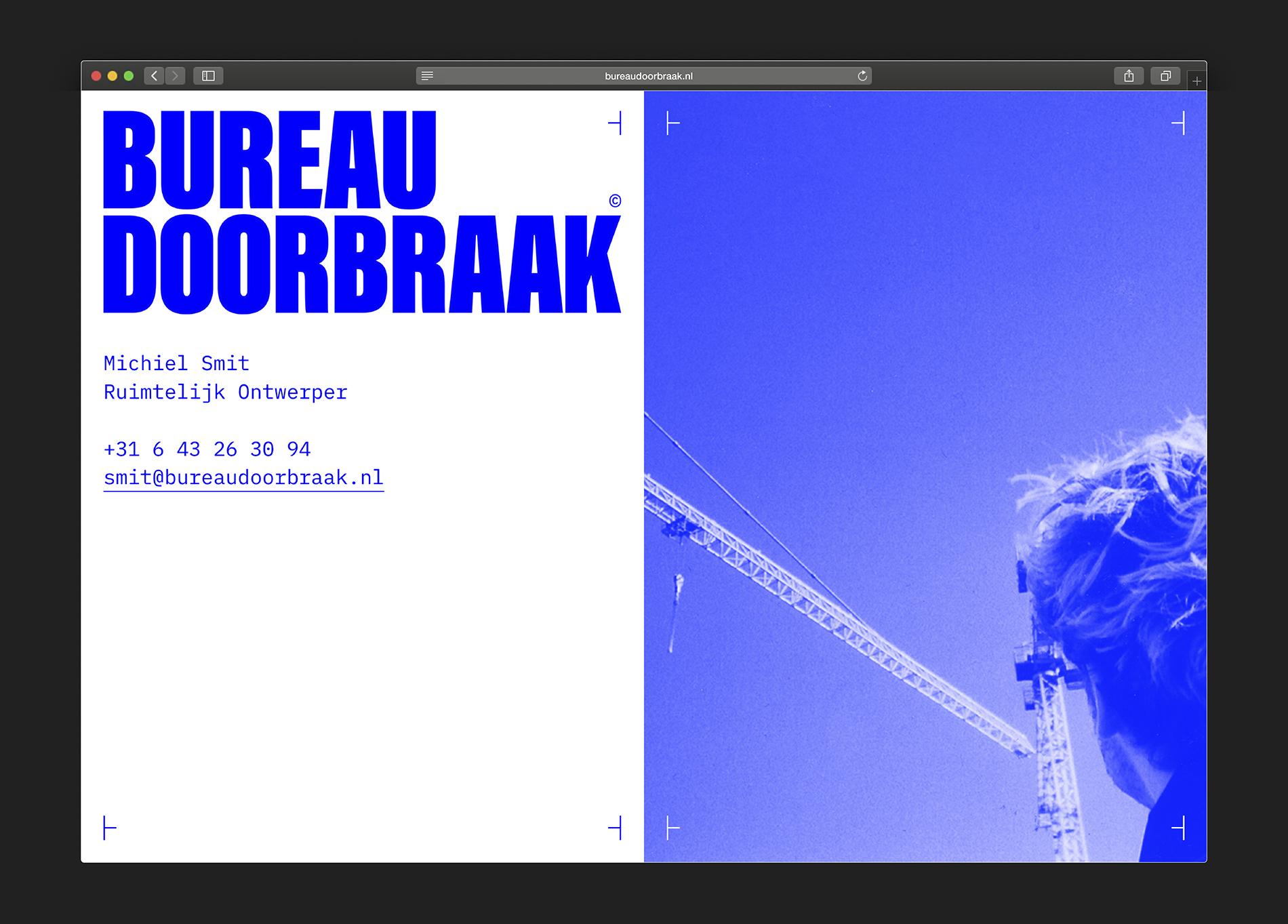
The monospace font reflects the company’s precision and architectural identity

Bureau Doorbraak is a company that supervises construction projects as well as designs them. The clear and strong visual identity relates to the blueprint, which is the nessecary basis for the design of a space. The blueprint stands for the work method of Bureau Doorbraak.