
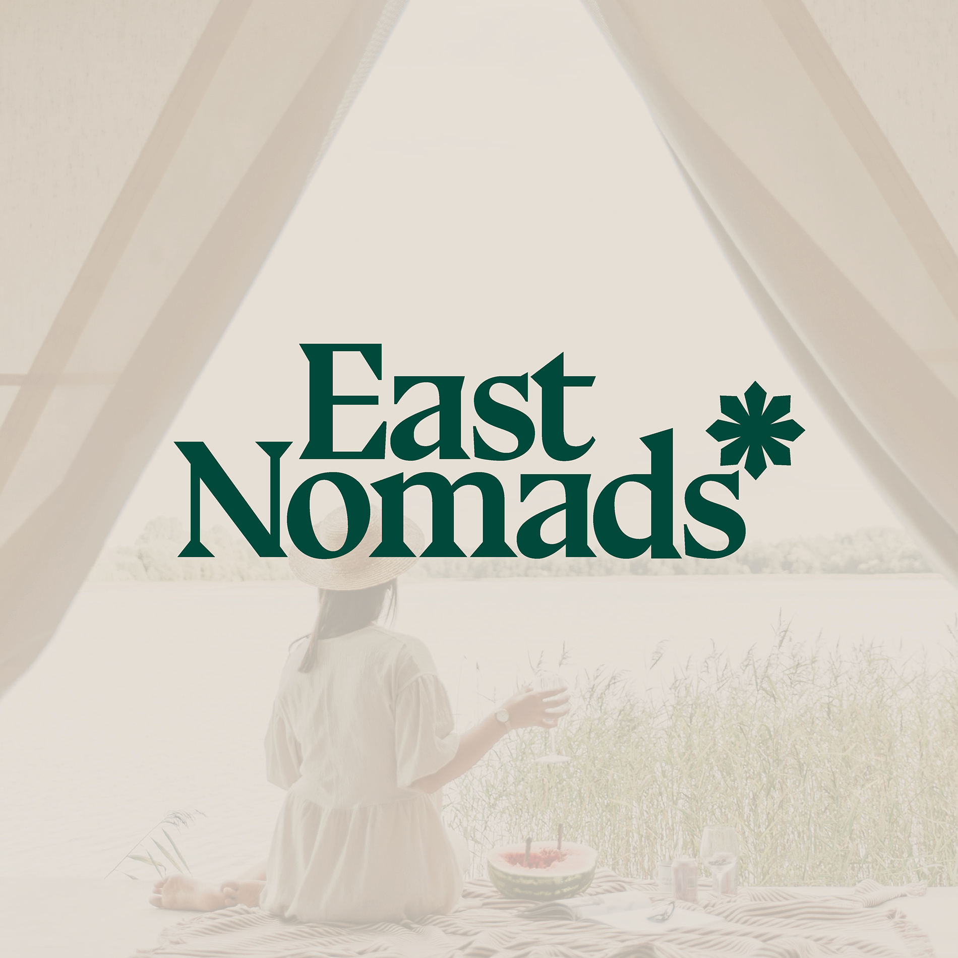
East Nomads
For De Burgemeesters
Visual identity for a nomadic travel agency navigating the refined adventurer.
For De Burgemeesters
Visual identity for a nomadic travel agency navigating the refined adventurer.


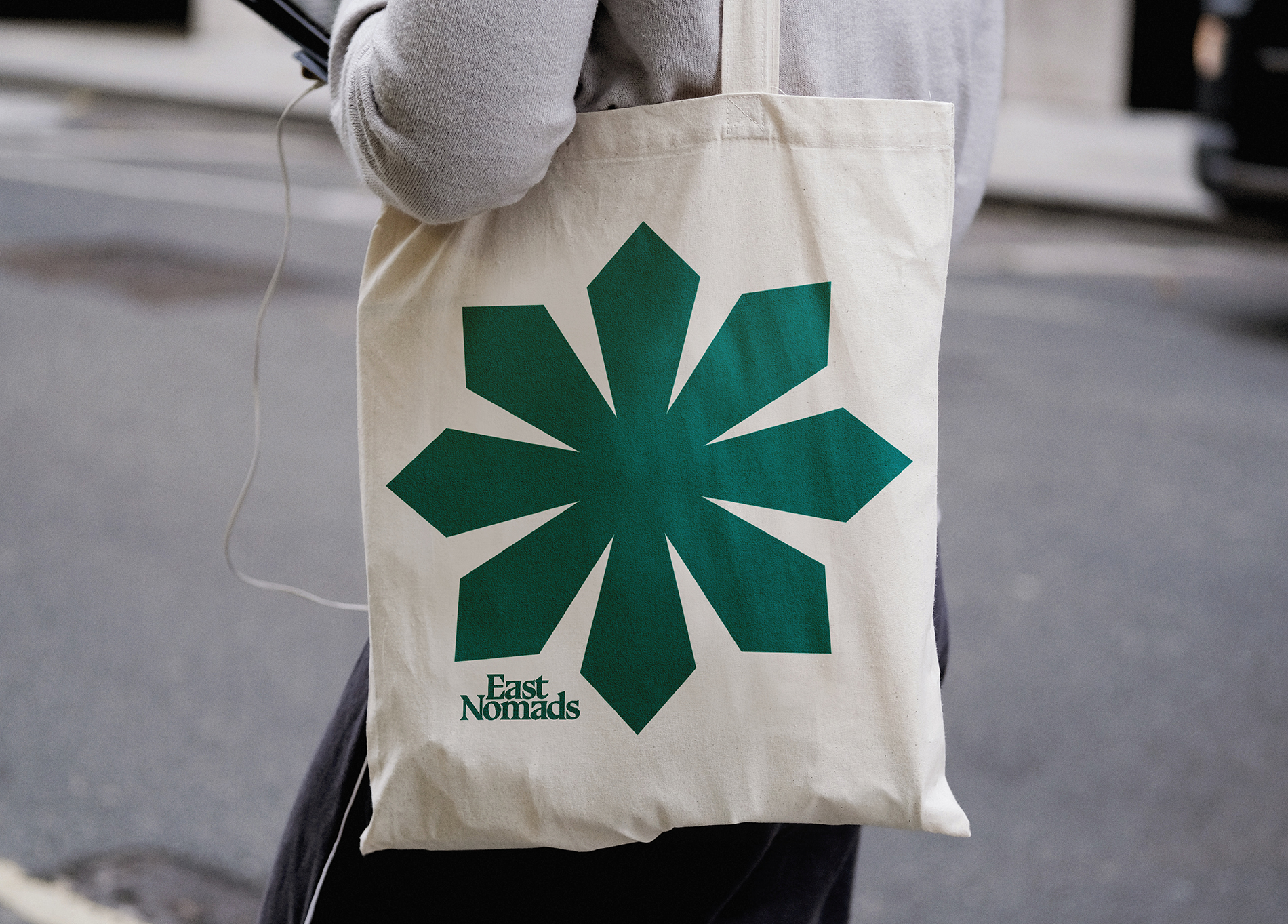
The compass symbol guides nomads and serves as a key element of the identity


A bold serif, inspired by early cartography, gives the identity a strong look


With a name like East Nomads, the concept quickly took shape. We aimed to capture the essence of nomads — constantly on the move. Historically, nomads followed the Polestar, while modern nomads used a compass. To symbolize both, we chose the asterisk, representing guidance and discovery.
For the typography, we paired the adventurous Bluu Next with the neutral Helvetica to create balance. This contrast reflects East Nomads: a blend of luxury and nature, movement and stability. The result is a playful identity that brings the nomadic spirit to life