
Hendrick de Keyser Monumenten
For HdK Marketing & Communication
Brand identity transformation for the foundation that keeps the architectural history of the Netherlands alive.
For HdK Marketing & Communication
Brand identity transformation for the foundation that keeps the architectural history of the Netherlands alive.


We chose to officially rename the color blue of Hendrick de Keyser into ‘HDK BLUE’...


...and give this ‘HDK BLUE’ color a key role in all branding


We also gave the two existing typefaces a bigger contrast and specific functions


This new typographic direction creates a more recognizable identity


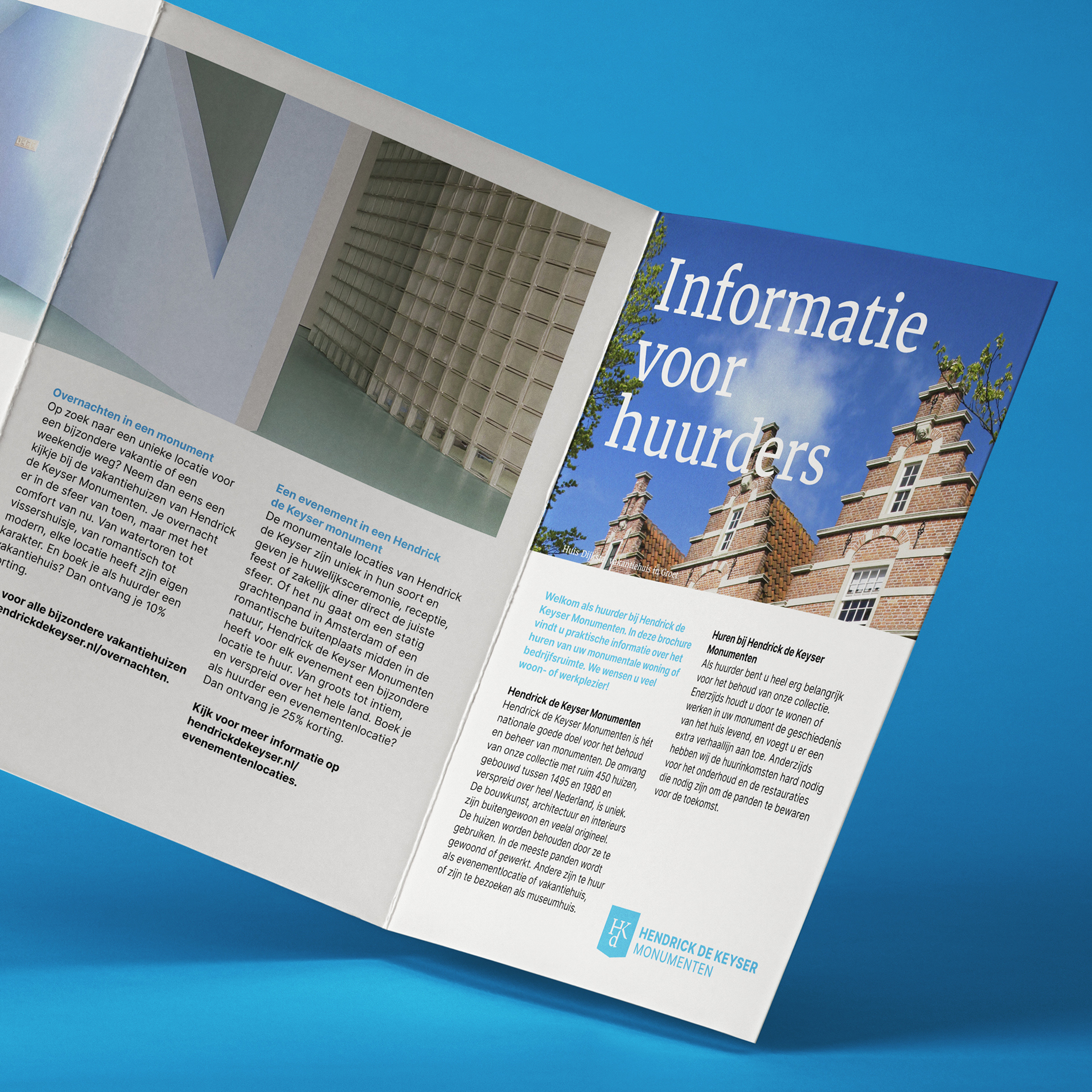
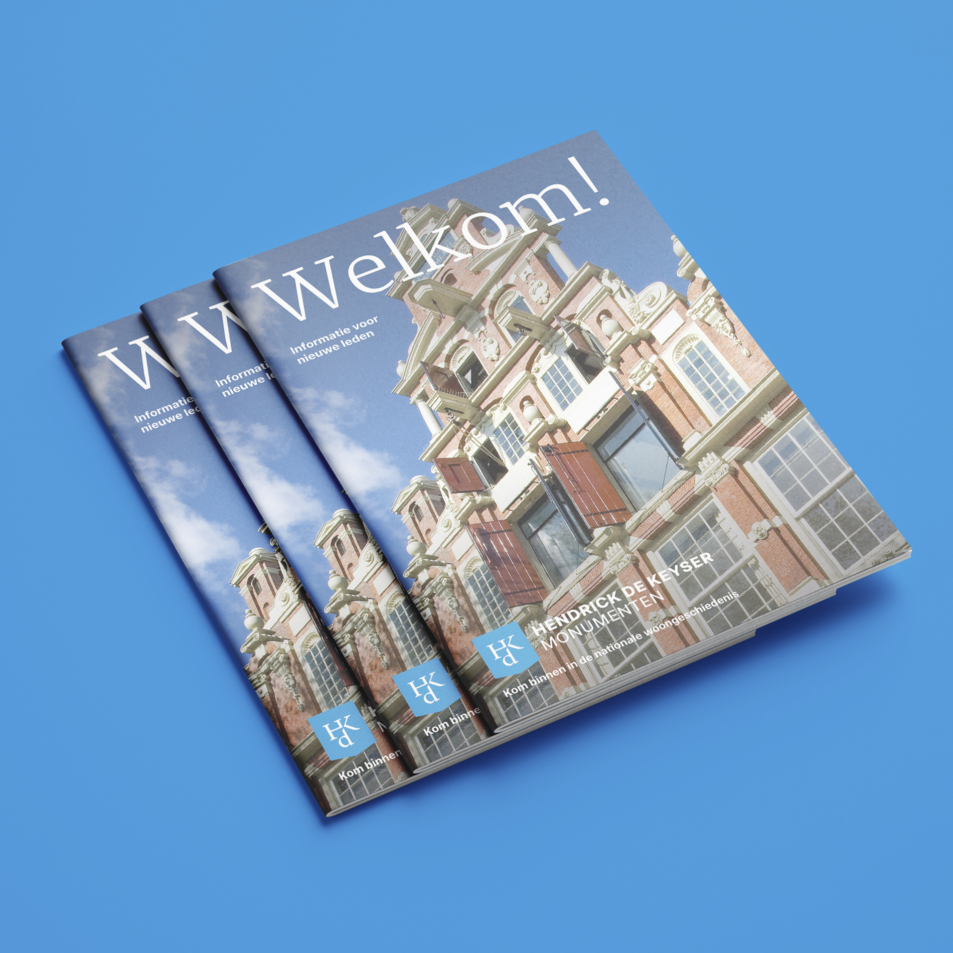
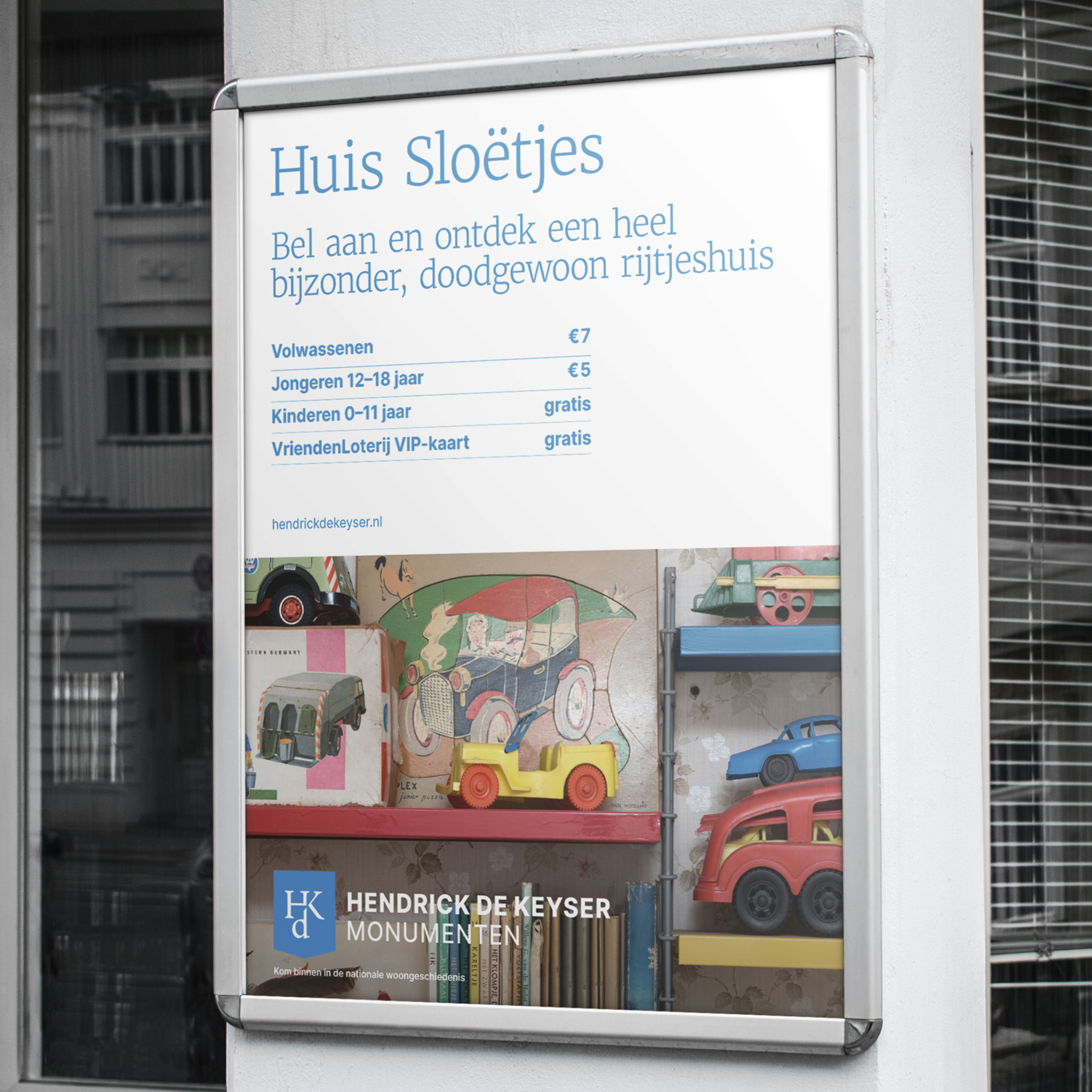
The aim of the rebrand is to communicate the significance of our architectural heritage


Hendrick de Keyser Monumenten has been committed to the preservation of architecturally or historically valuable monuments since 1918; buildings and their interiors. Once acquired, properties remain in their possession forever.
Hendrick de Keyser Monumenten asked Jan & Jaap to update their visual identity with an already existing logo and color. We chose to officially rename the color blue, ‘HDK Blue’ and give the color a prominent role in all communication output. The existing serif and sans serif typefaces were each given a specific role and bigger contrast towards each other, to create a more coherent identity. We traded the dark blue gradients for one clear recognizable blue applied throughout the whole identity.