

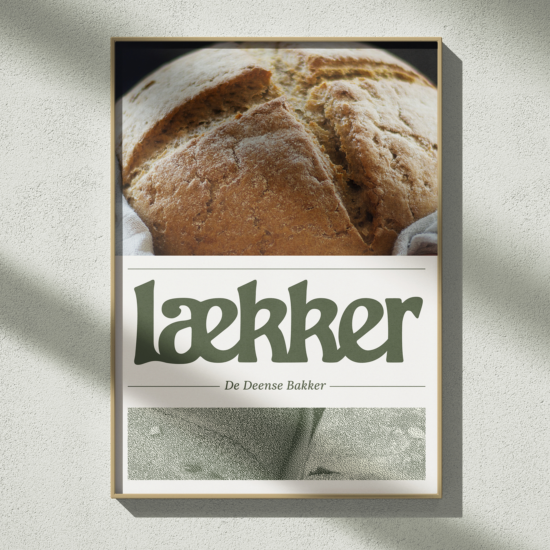
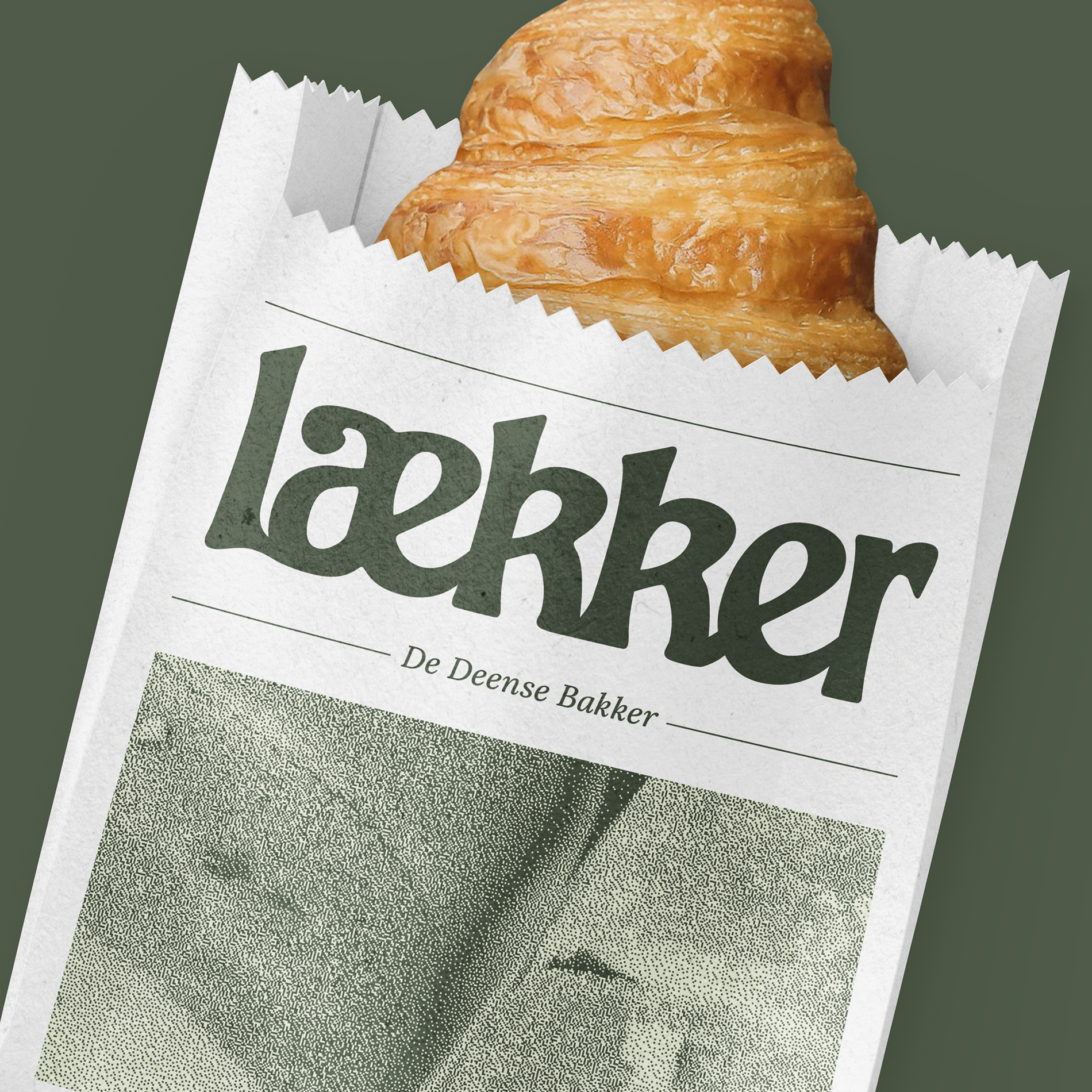

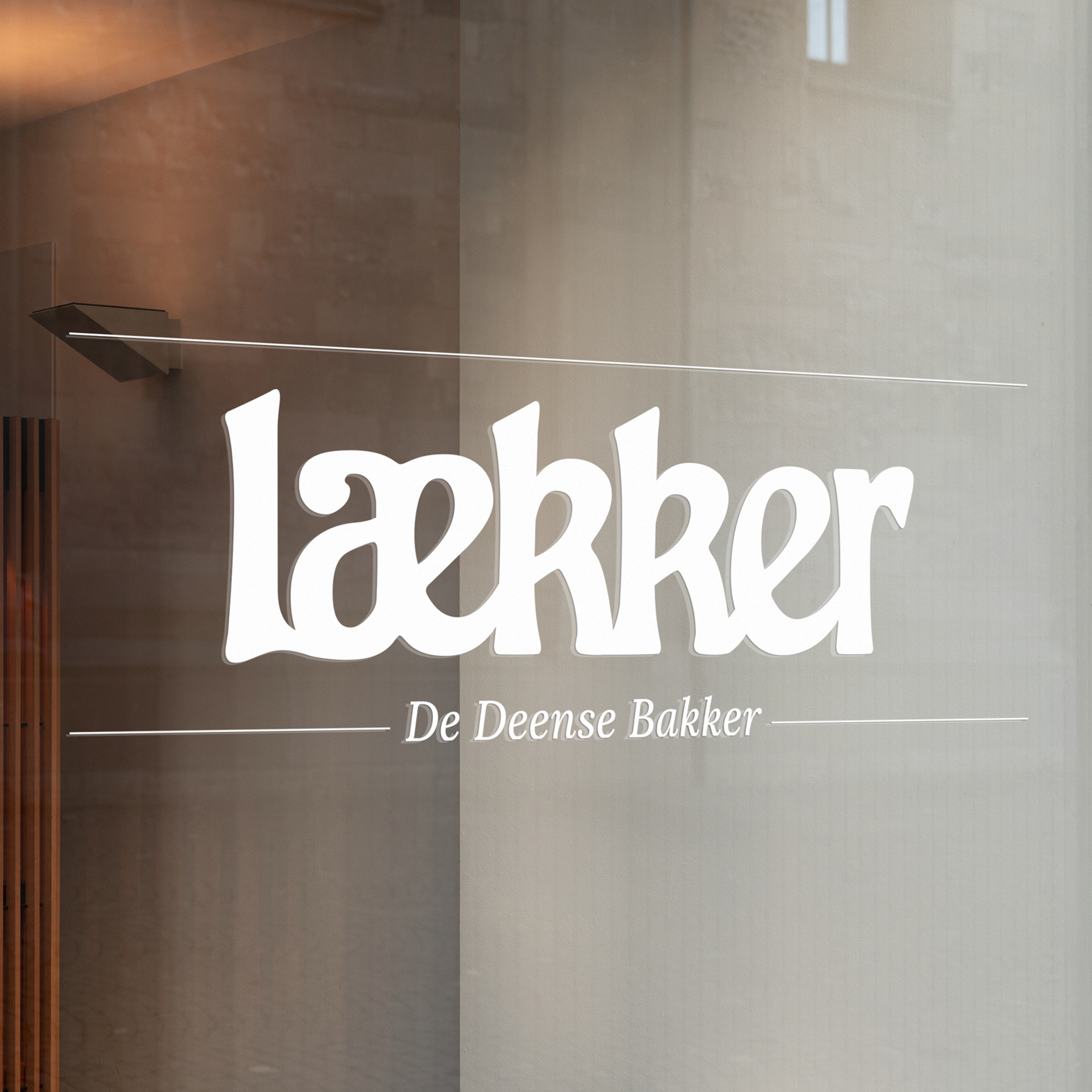
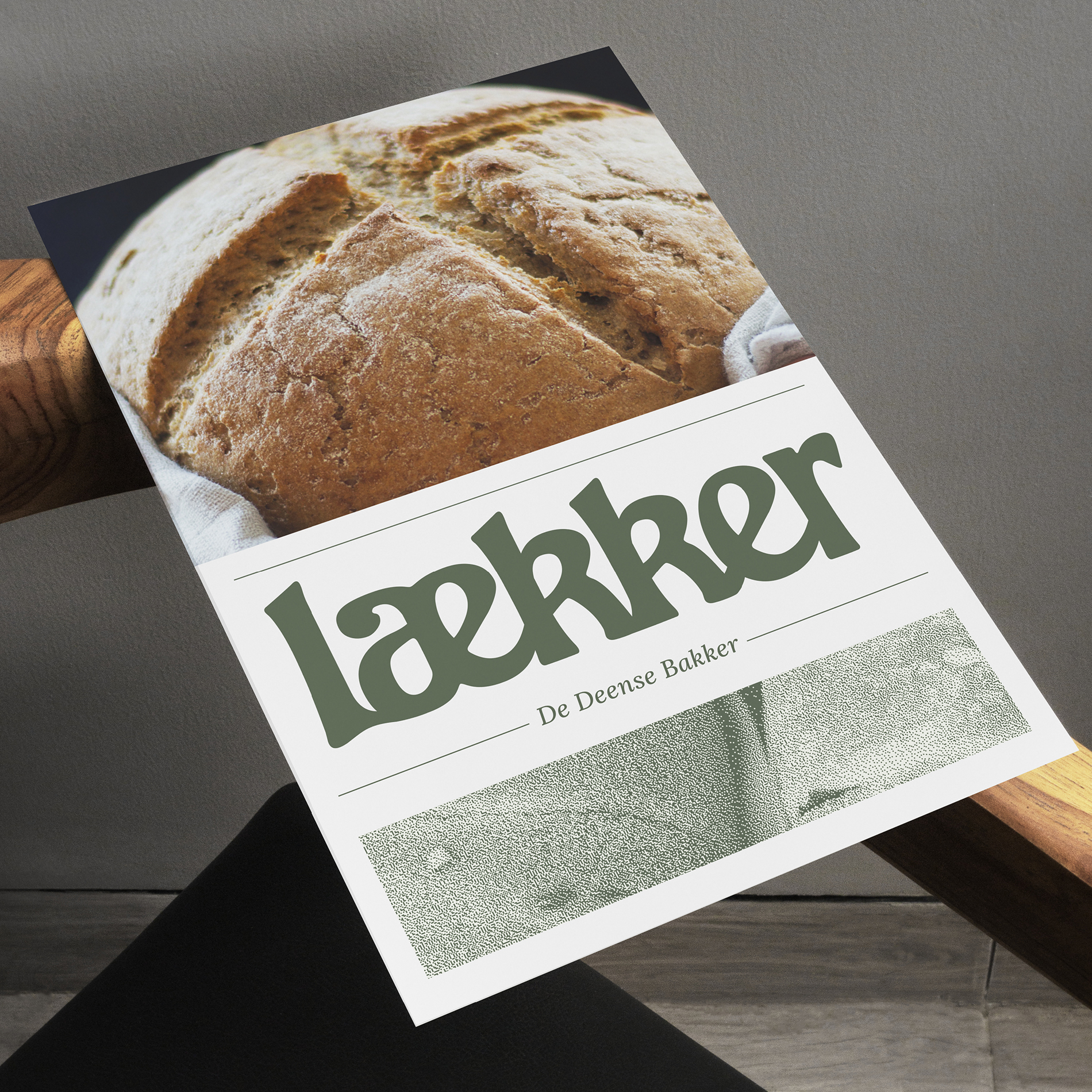
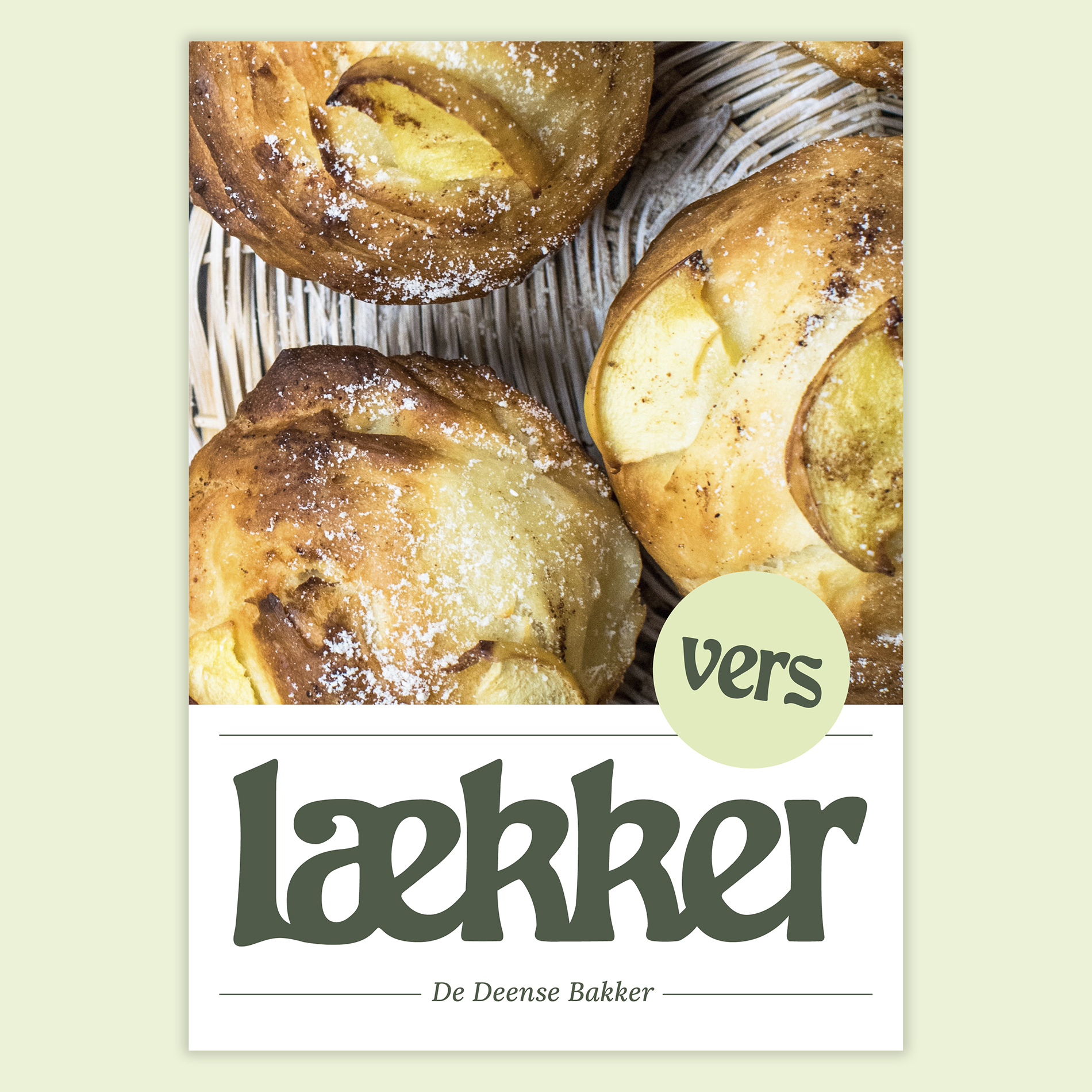
The logo has literally risen in the oven to become a bread or pastry


In the branding, the ae ligature can be replaced by a pastry

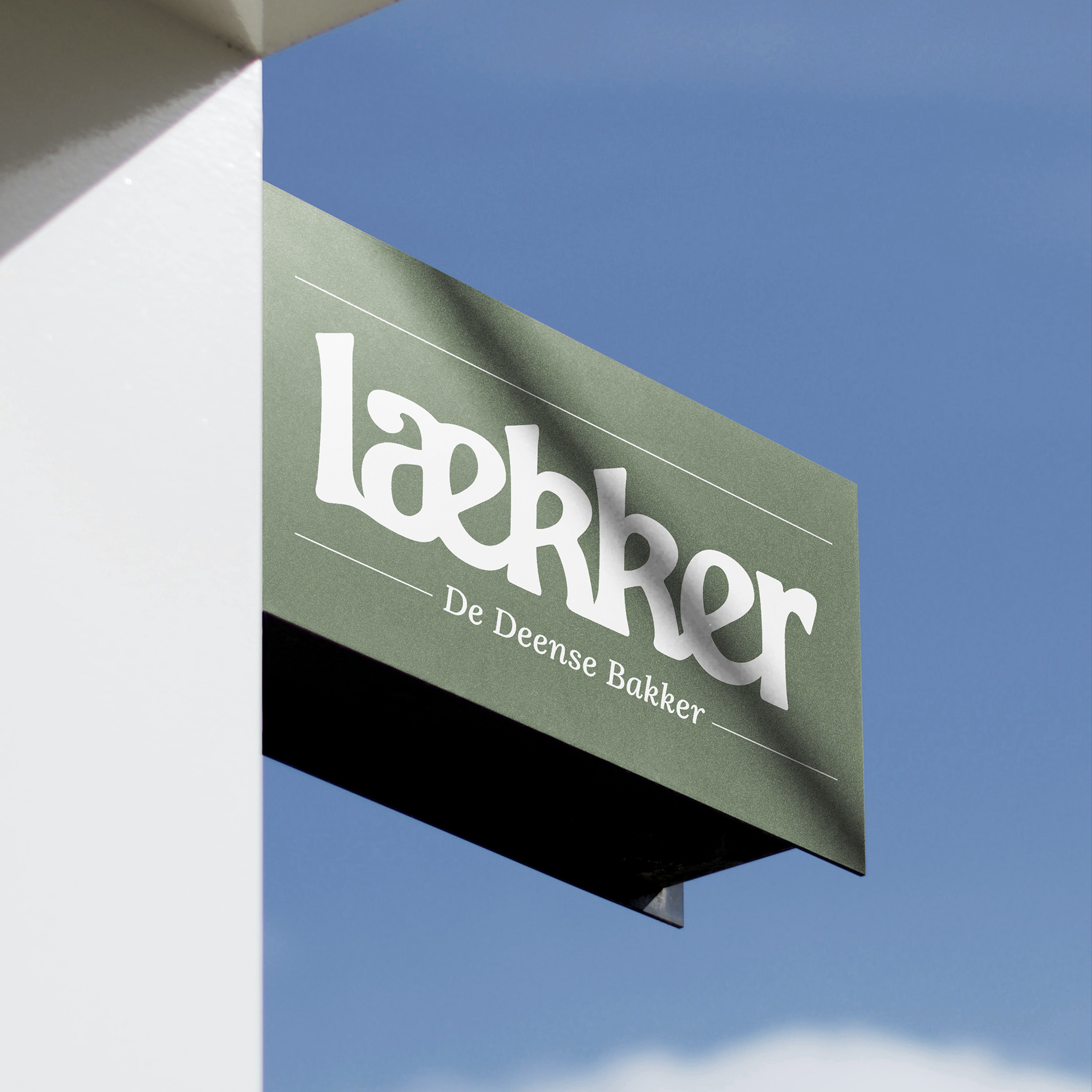
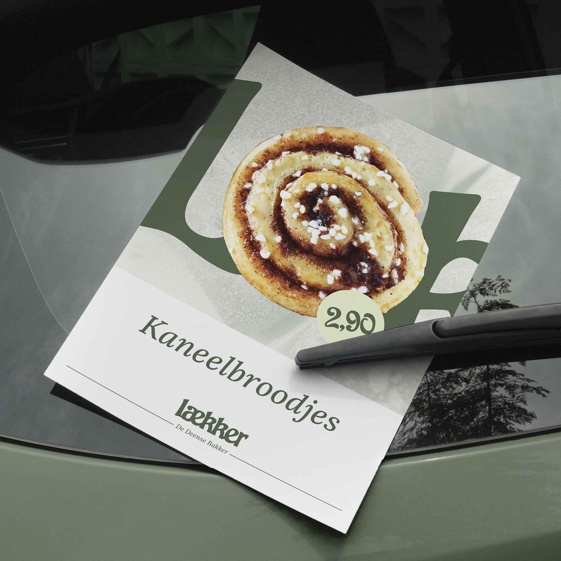
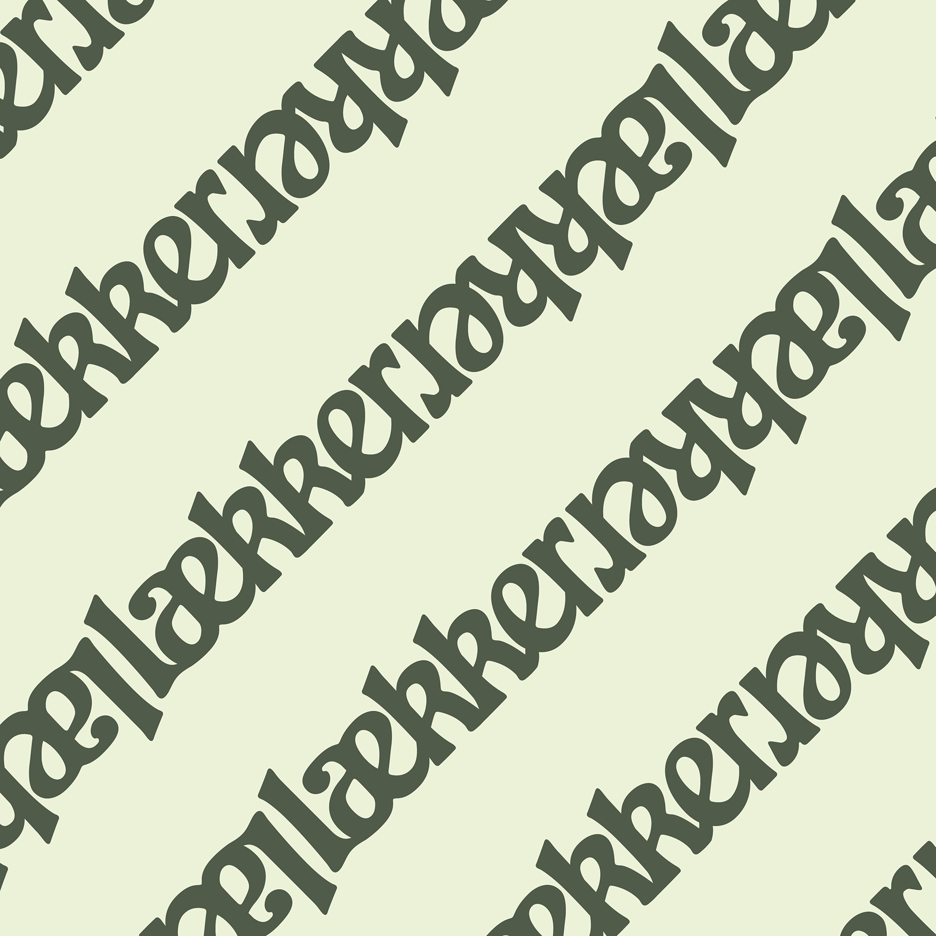
The green color gives a warm and domestic atmosphere to the identity


Laekker is an artisinal bakery concept with Danish and Dutch influeces created by Albron, the biggest foodservice organisation of the Netherlands. Albron asked Jan & Jaap to create a new visual identity that would communicate the company’s new bakery concept. The logo has literally risen in the oven, and it’s round shape gives the identity a warm atmosphere. The logo symbolises the baking process and the ae became a ligature, that can be replaced by any pastry.
Brand name & strategy: Sjoerd Zonderland