
Liberty Life Essentials
For Olaf Piers
Branding, website and sustainable packaging for premium supplements for every phase of a man’s life.
For Olaf Piers
Branding, website and sustainable packaging for premium supplements for every phase of a man’s life.
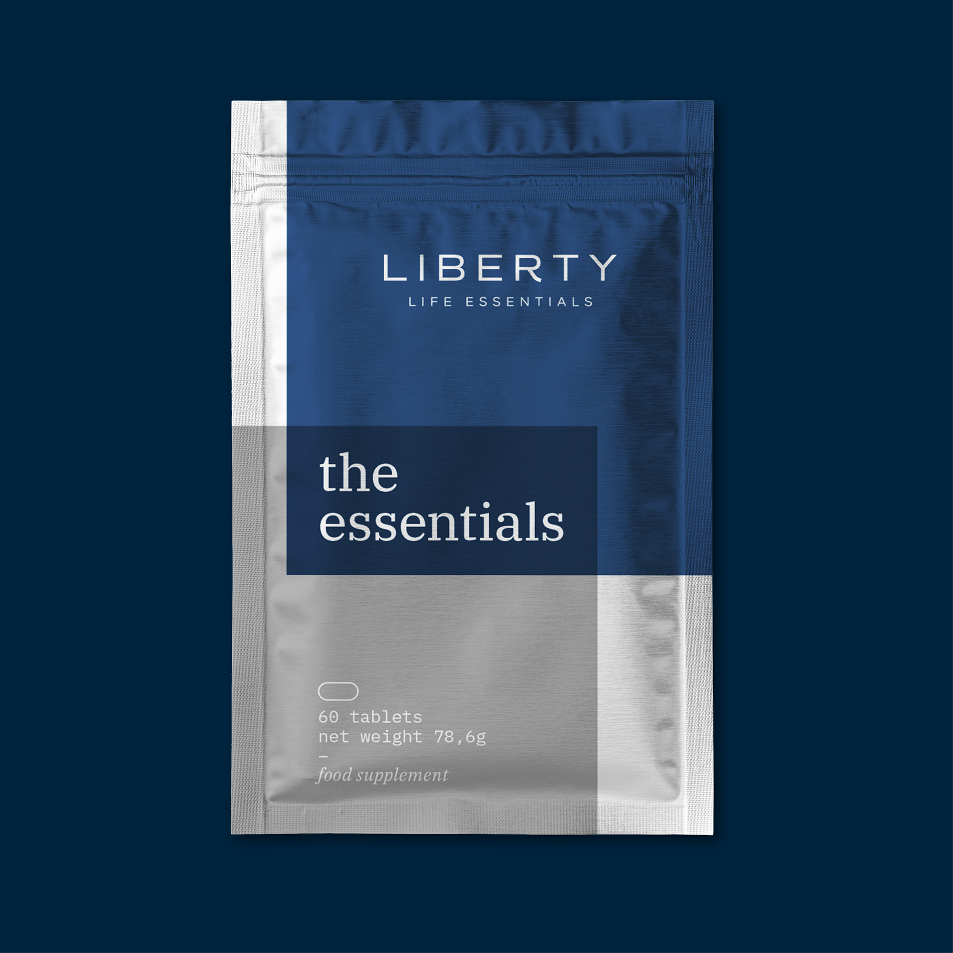
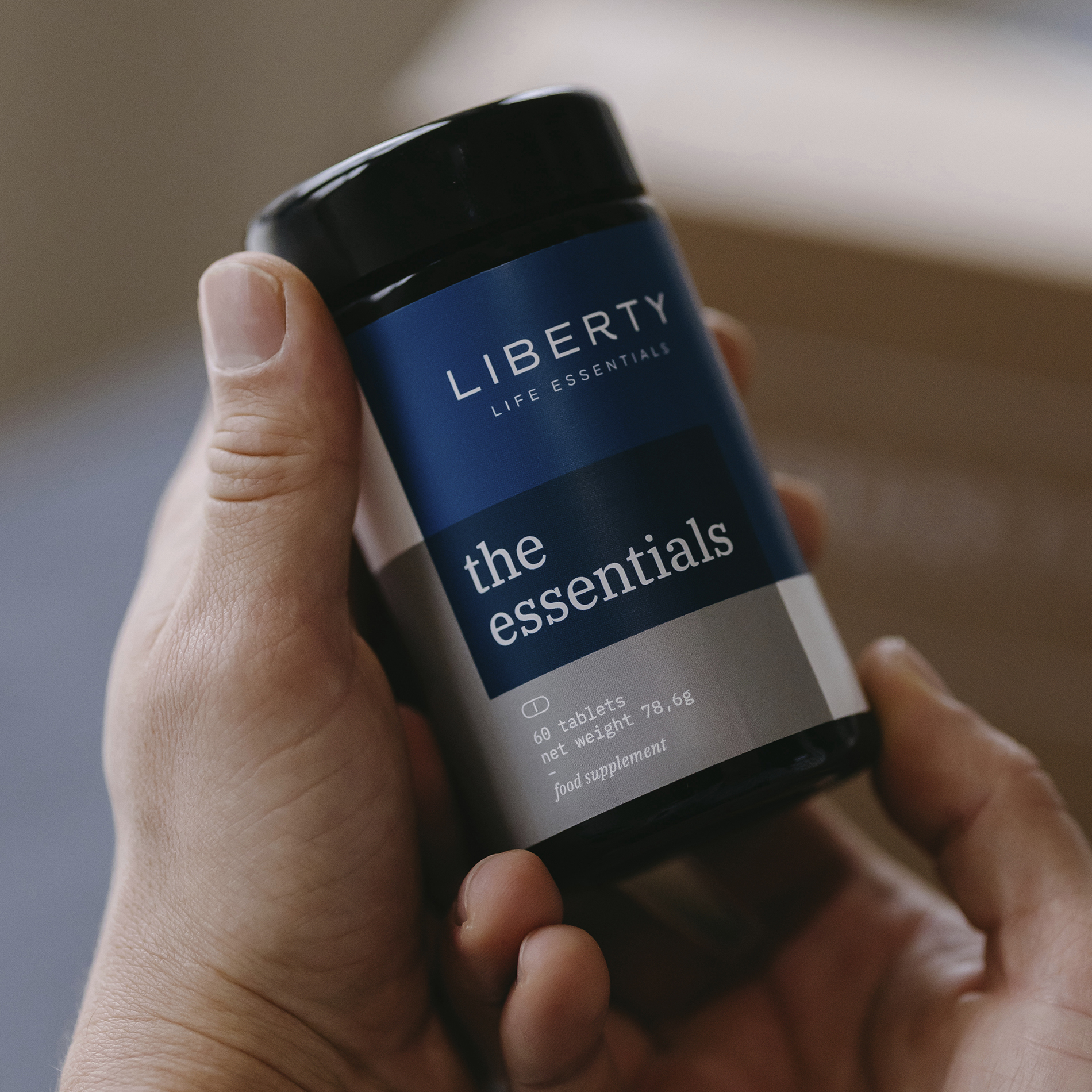

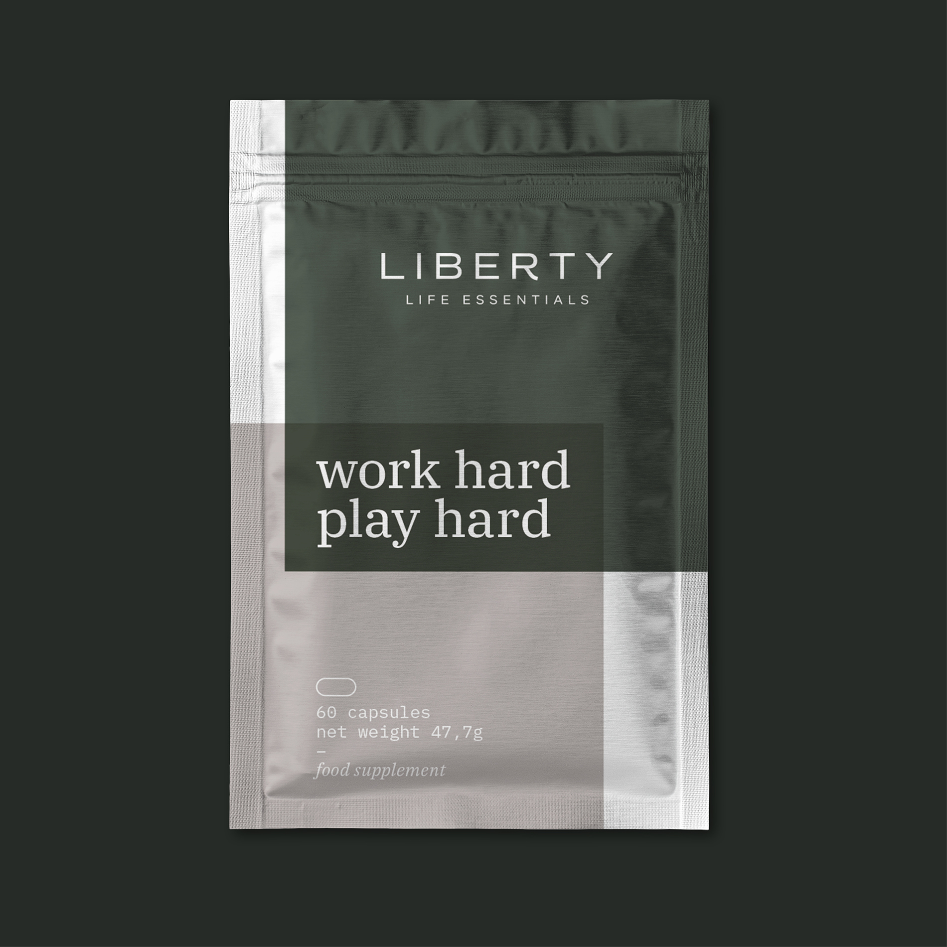
The identity represents chemical mixture bonds in an abstraction


The shapes and colors are combined with a friendly serif typeface for display text

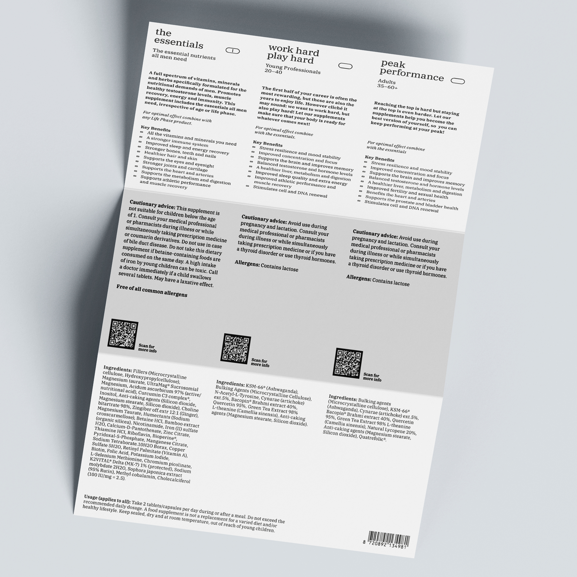

For the scientific tone we use a monospace version of the typeface


By overlapping the two colored shapes, they interact and bond with each other
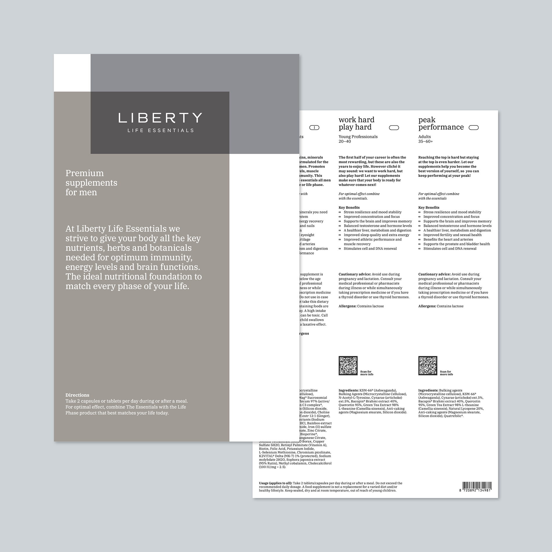

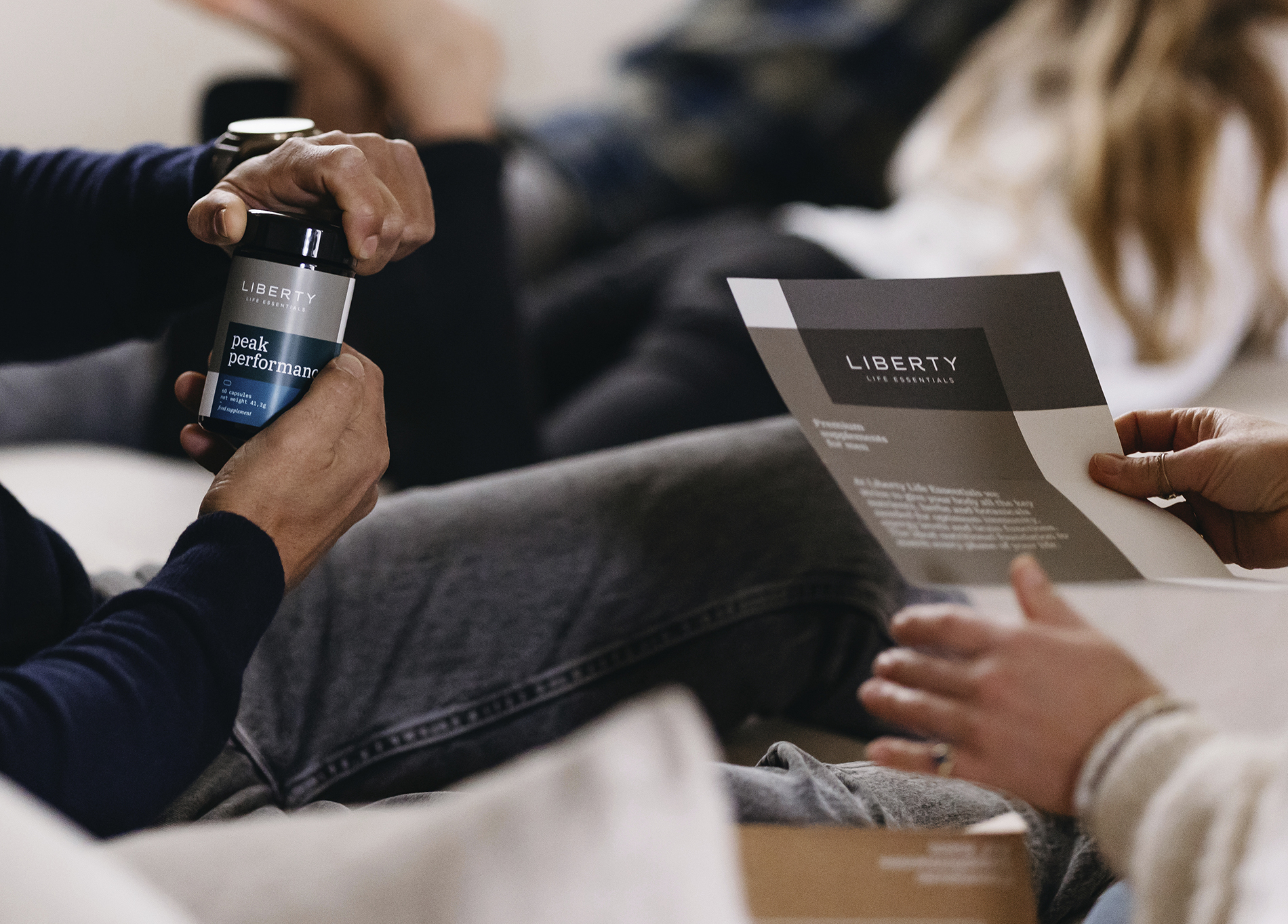
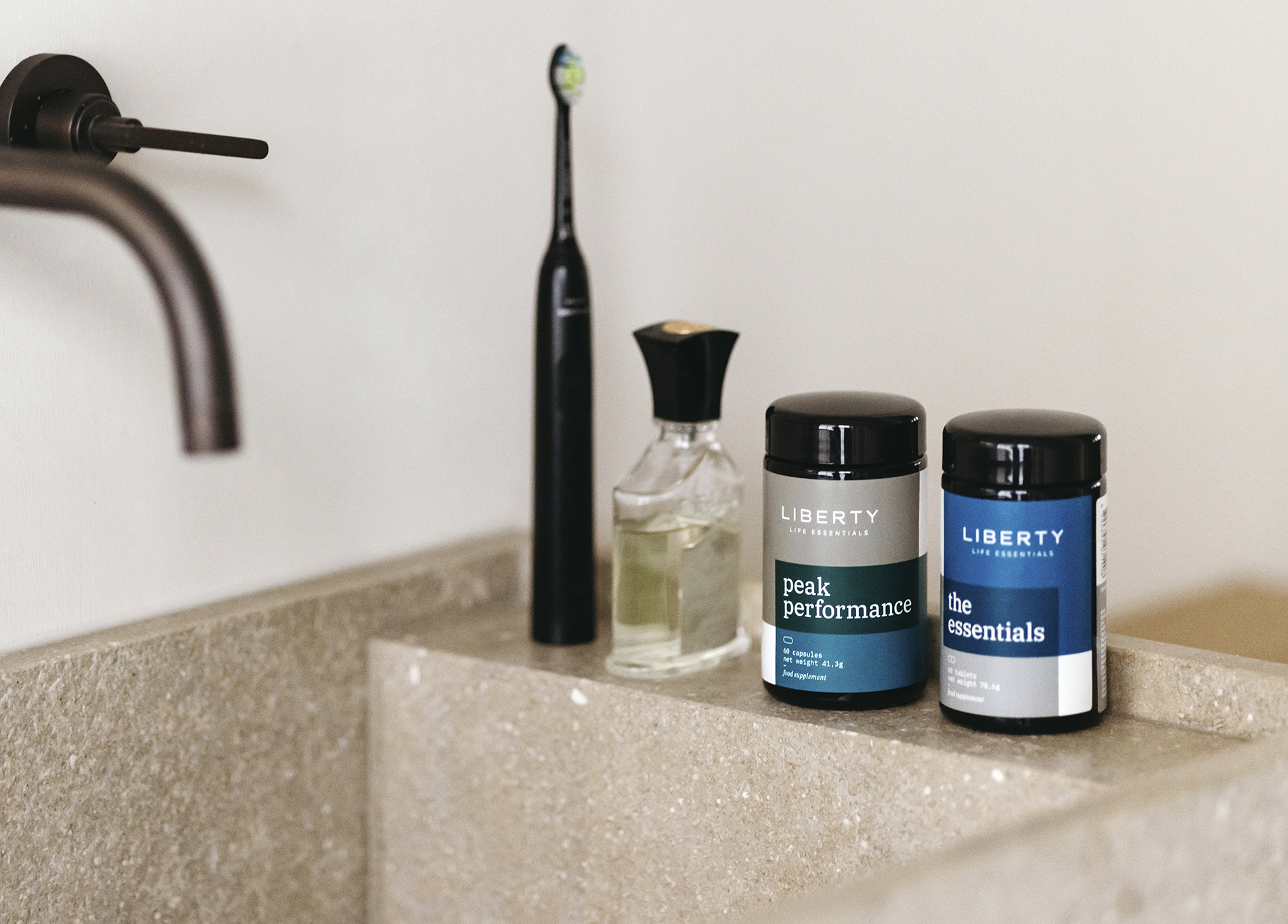
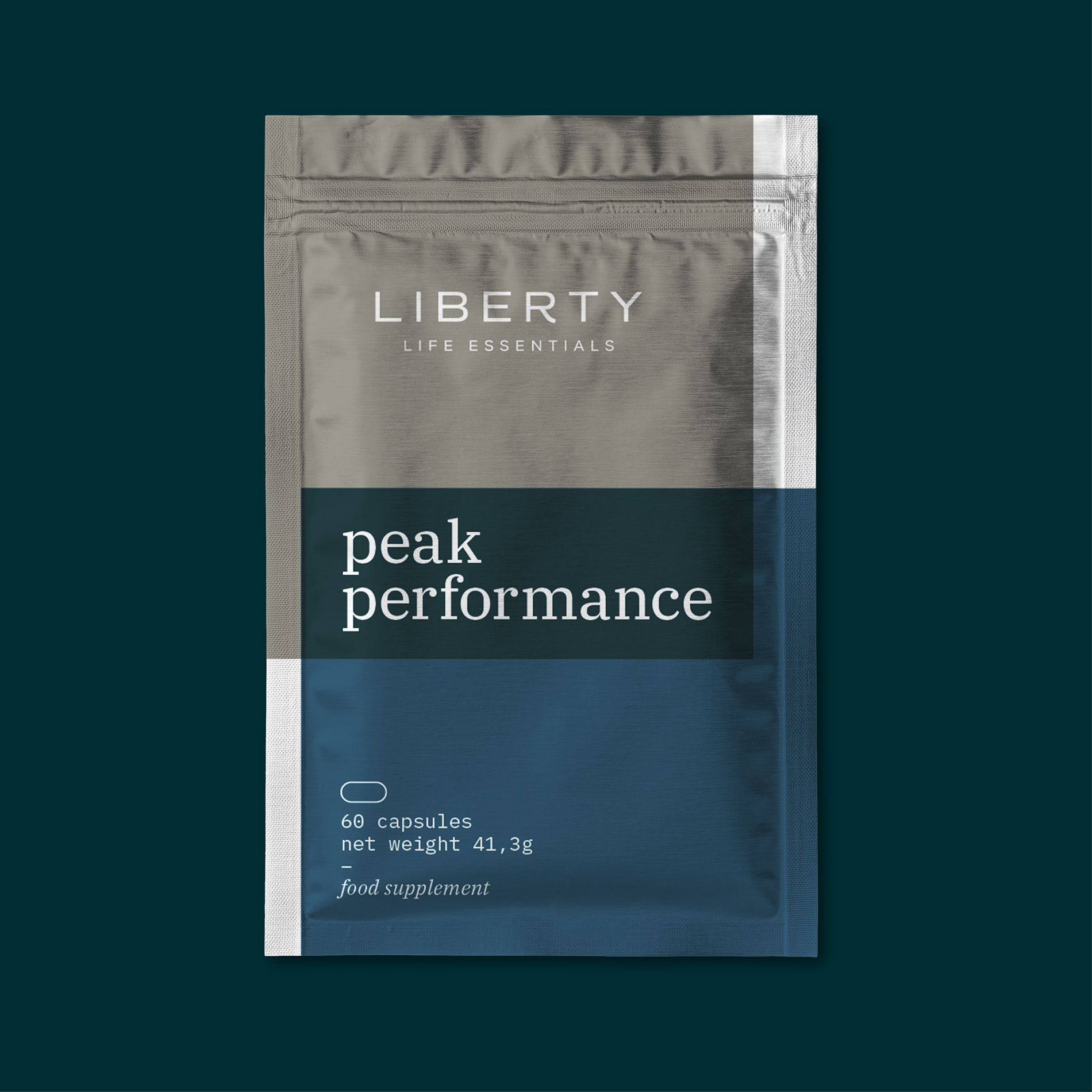
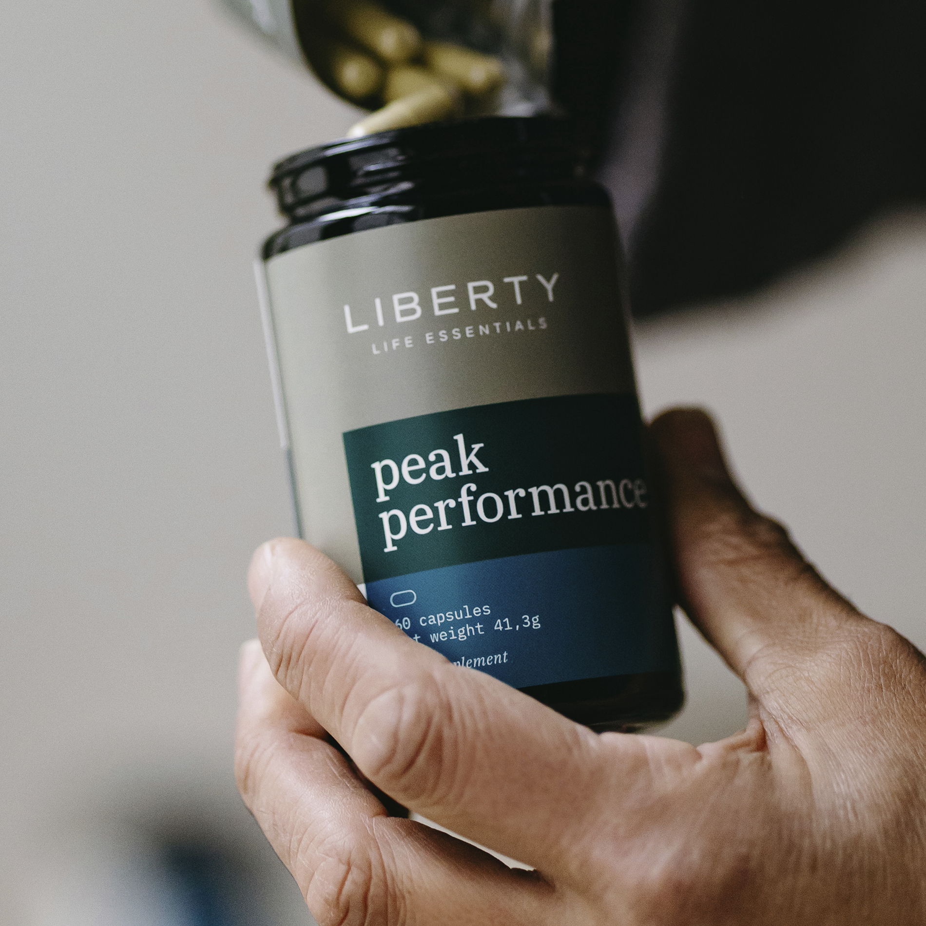
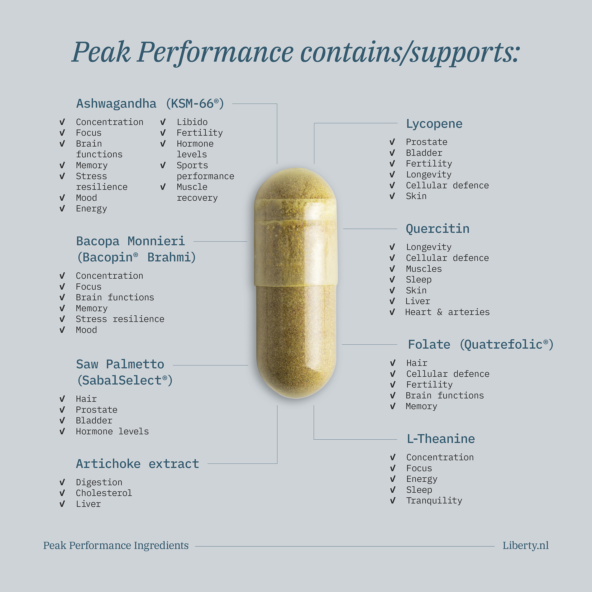
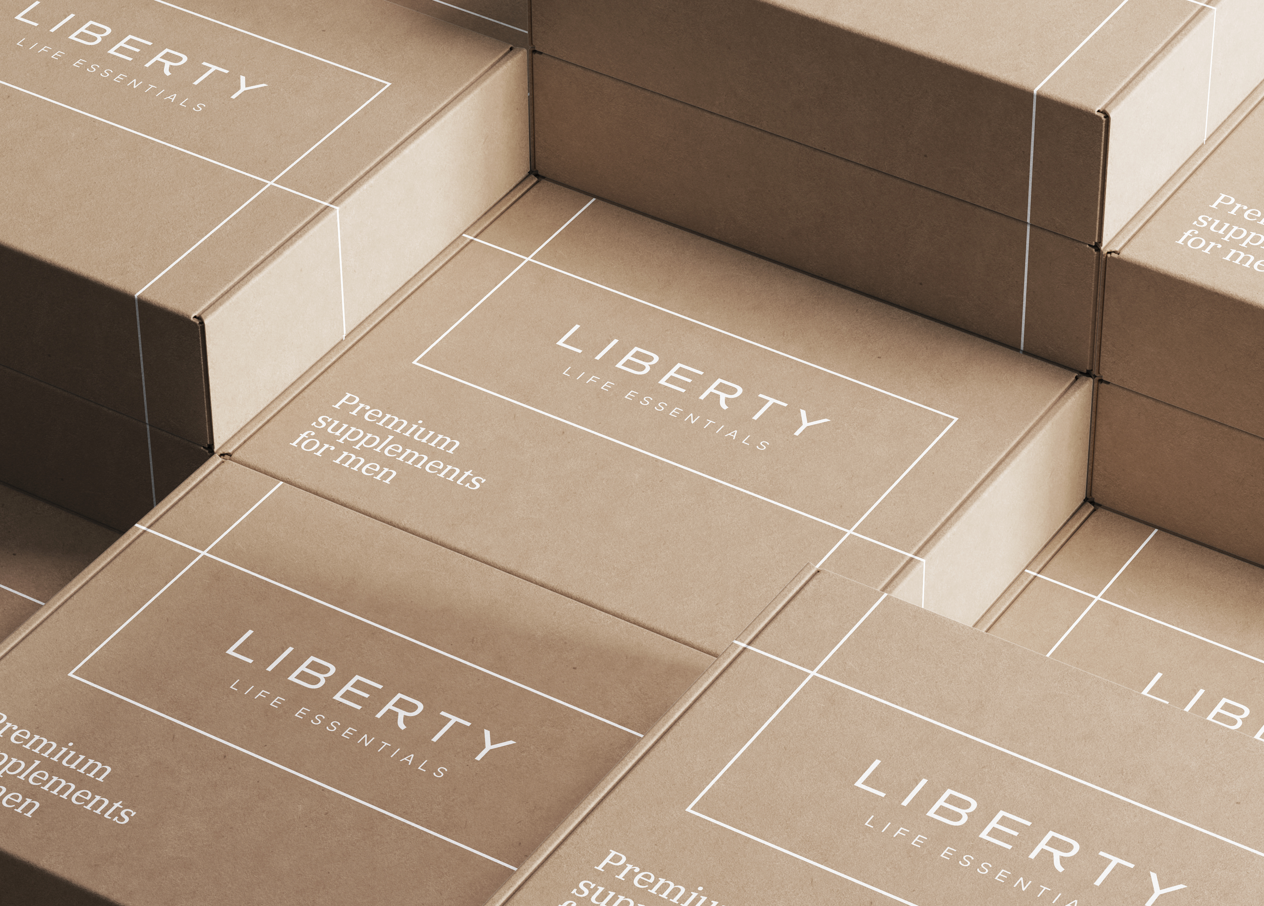
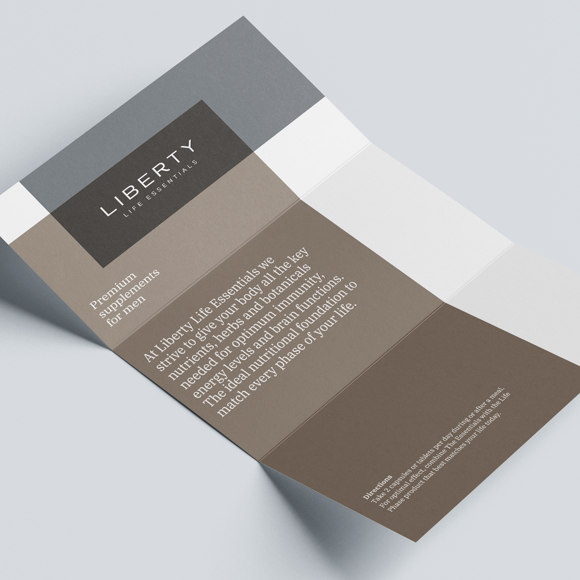
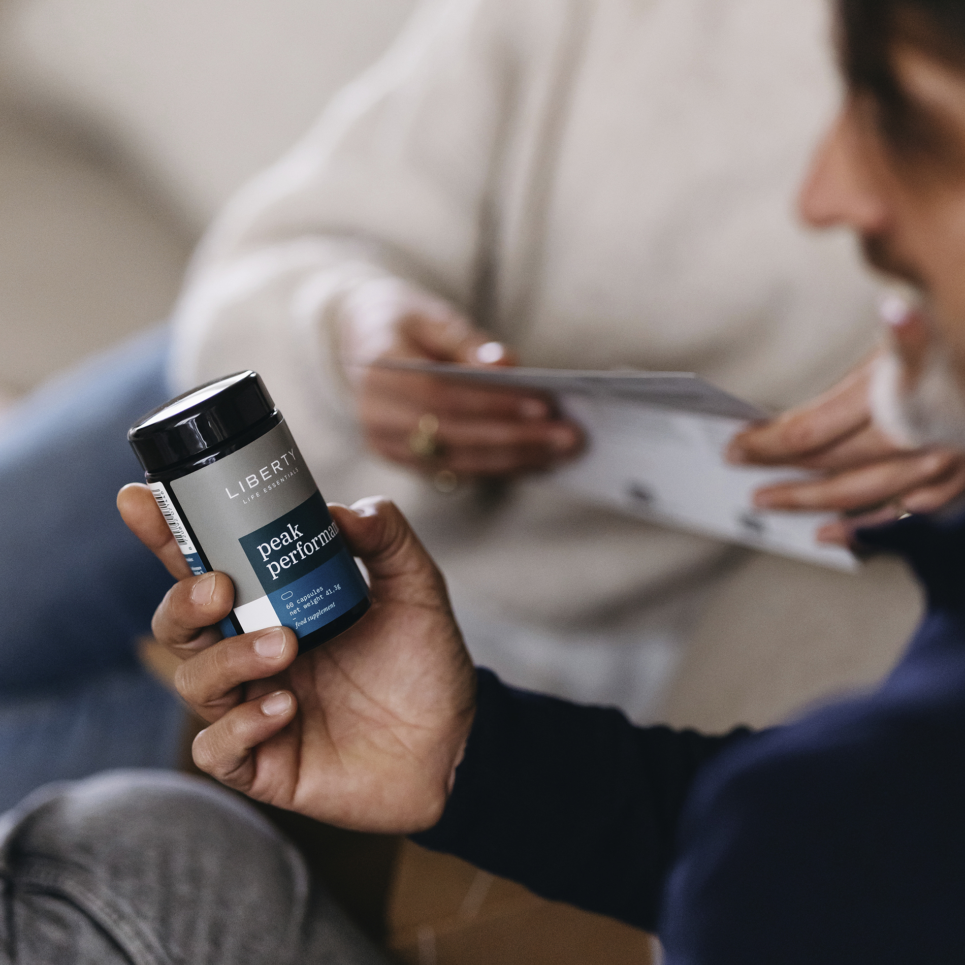
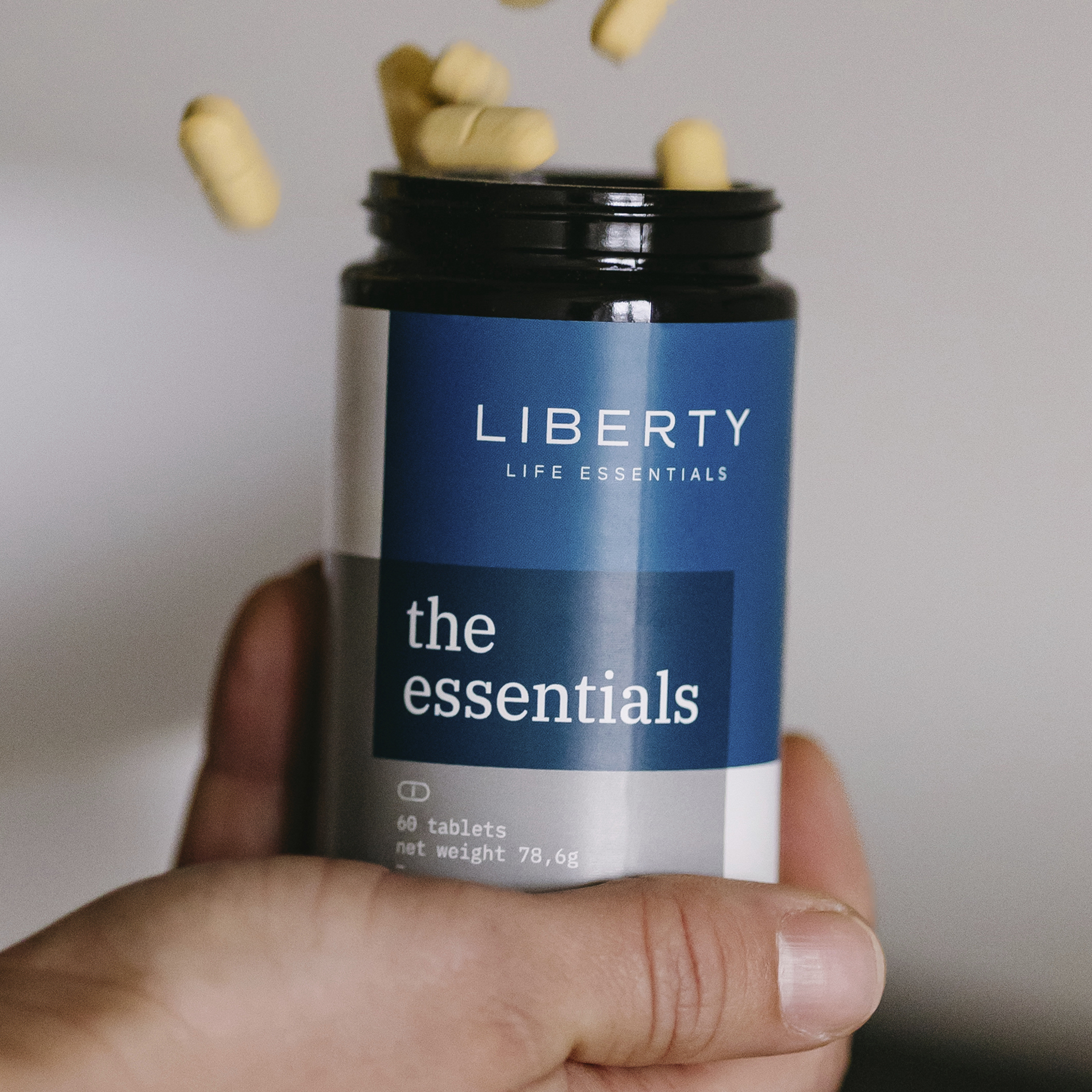
Liberty Life Essentials aims to give men of all ages the nutritional support needed to become the best version of themselves through all phases of life. With an already existing logo, LLE asked Jan & Jaap to develop the brand further. The visual identity is based on two overlapping colored shapes, that interact and form a bond between the ingredients and the body. This visual element allows for a playful and flexible visual system on any canvas, while the typography is clear and confident. The shapes and colors are combined with a serif typeface for display text. Added for the scientific tone Jan & Jaap used a monospace version of the typeface that gives the identity a professional and precise appearance, just like the ingredients, mixtures and dosage LLE provides. With liberty life essentials, you are bonded for life. Jan & Jaap also designed the website and packaging for this project.
Photo’s by Alina Krasieva