

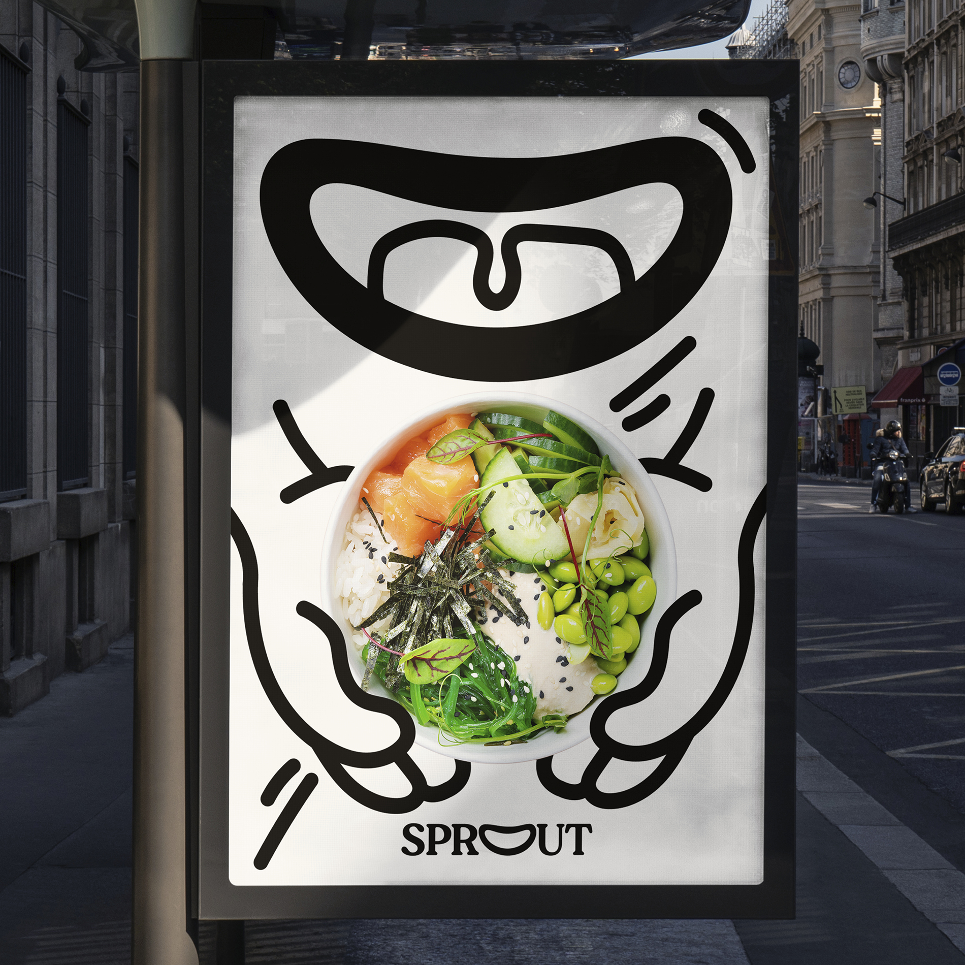
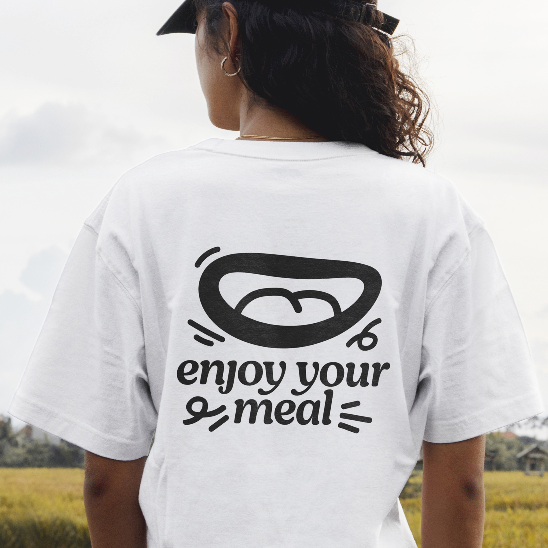
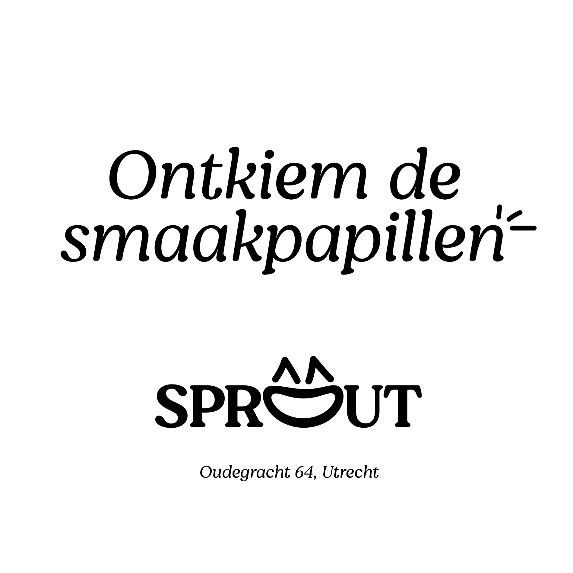

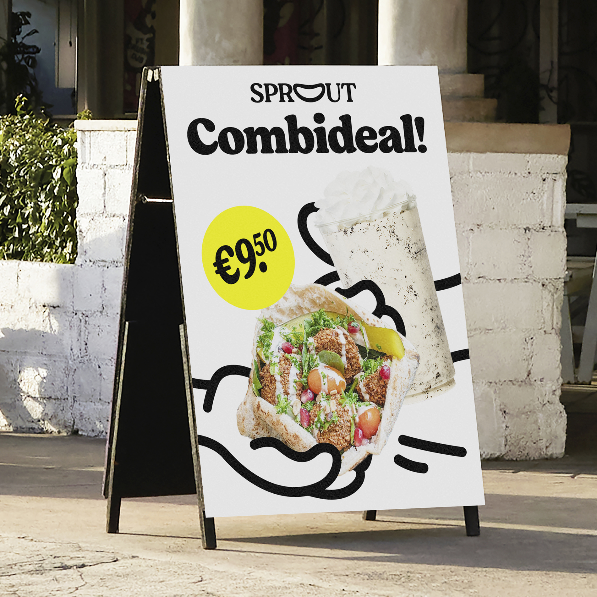
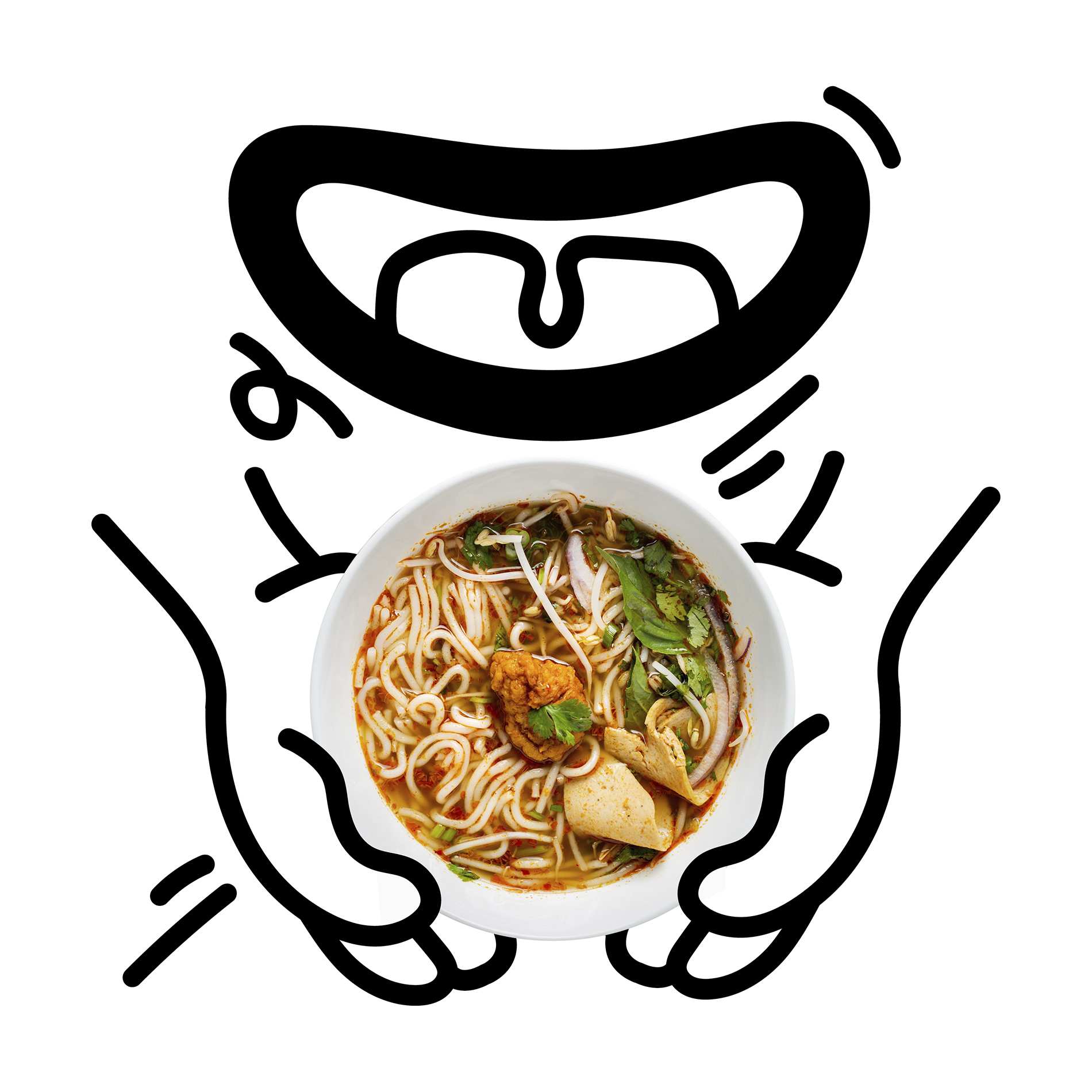
The key visual of the identity is the mouth logo, that can take on different expressions

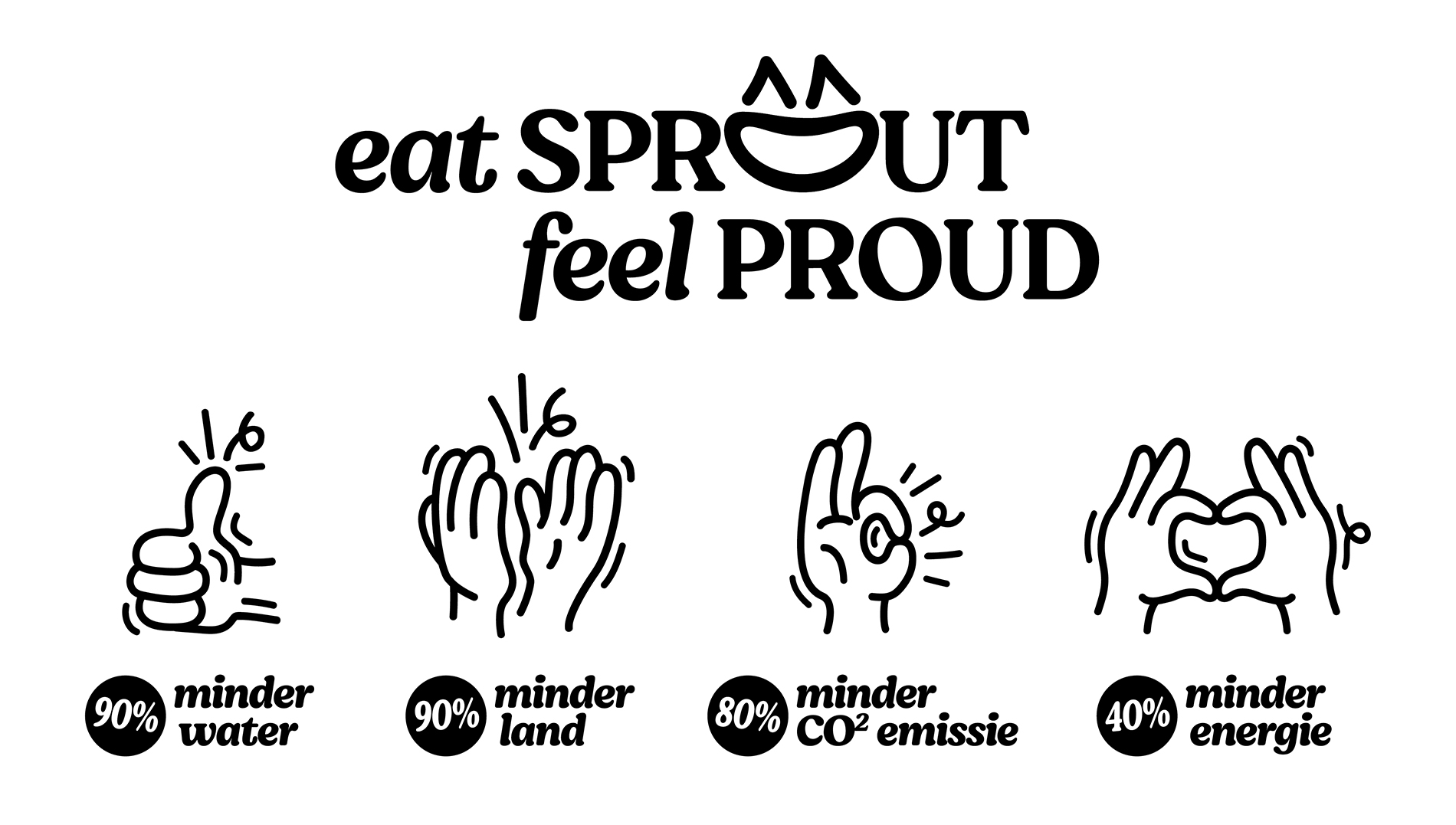
The illustrations enhance the positive power of Sprout’s core strategy
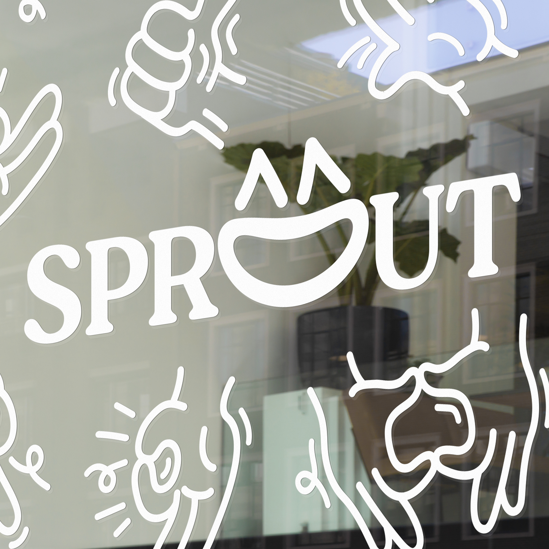
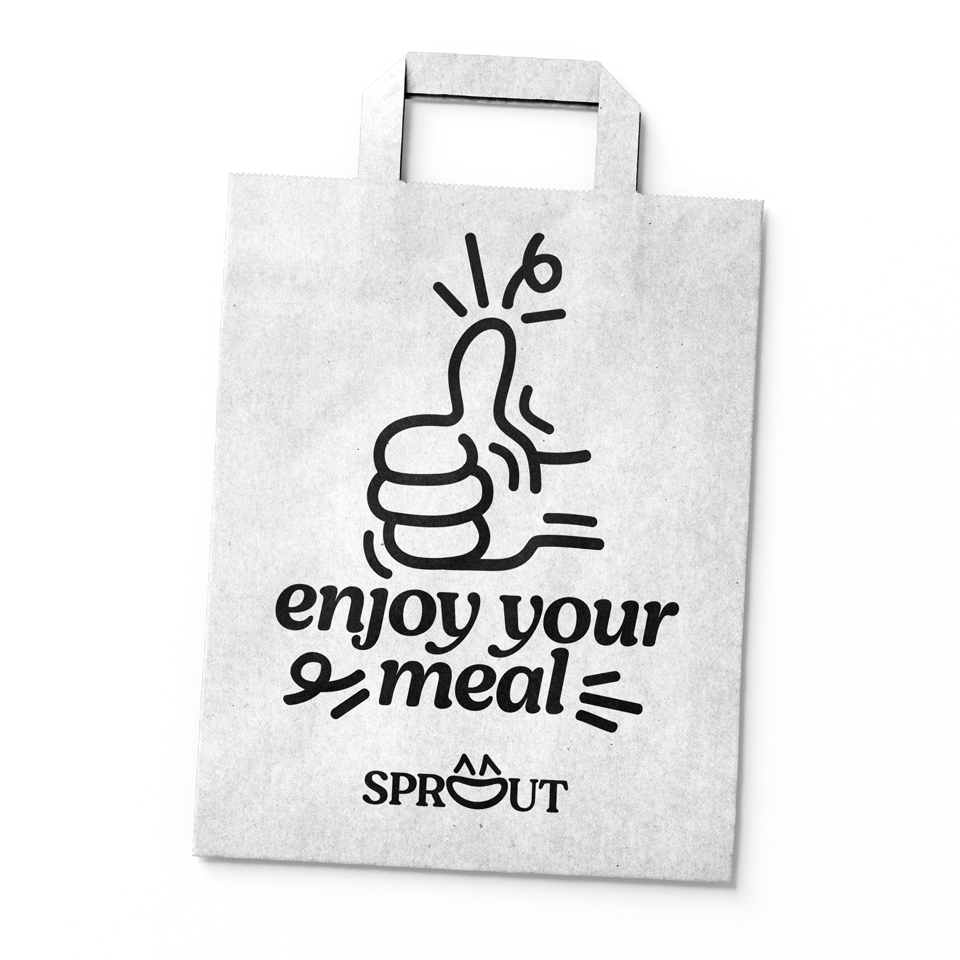


The identity is mainly in black and white, to emphasize the vibrant colors in the food photography

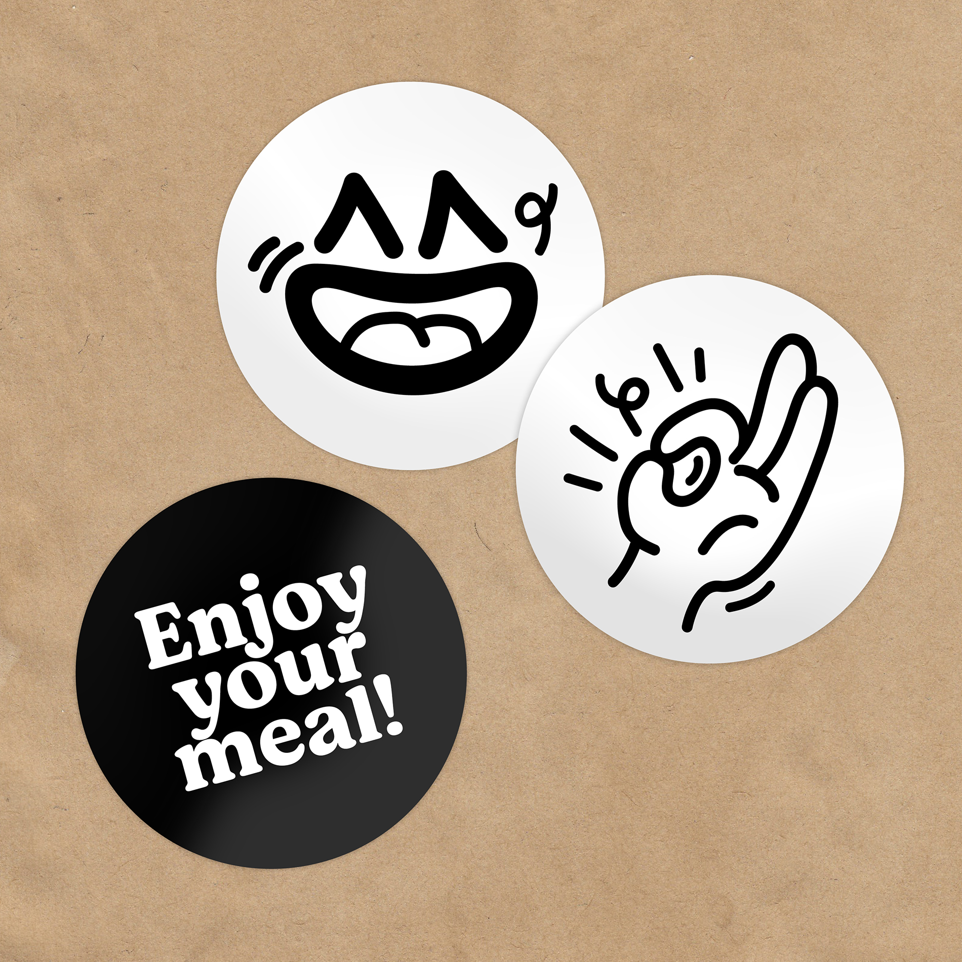
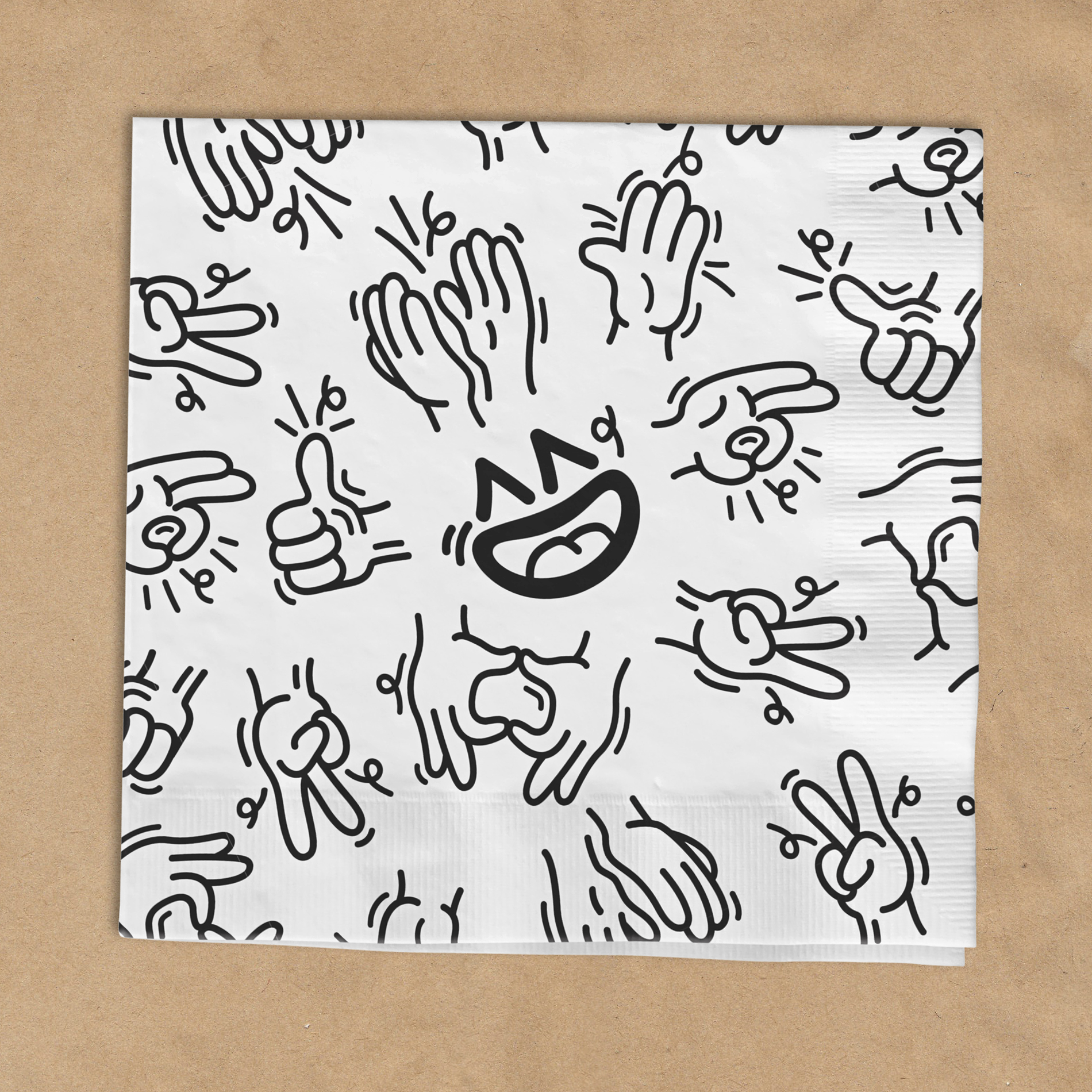

Sprout is a salad and bowl concept created by Albron, the biggest foodservice organisation of the Netherlands. The focus for this visual identity is illustrations that enhance the positive power of food. The logo can be used in various ways, from more serious to a more happy variation. All color of the visual identity comes from the food itself, the logo and copy is mainly in black and white, to emphasize the quality and freshness of the meals.
Brand name & strategy: Sjoerd Zonderland