
Tapisco
For Marcel van der Kleijn
Identity for the most authentic Spanish Portuguese restaurant in The Hague.
For Marcel van der Kleijn
Identity for the most authentic Spanish Portuguese restaurant in The Hague.
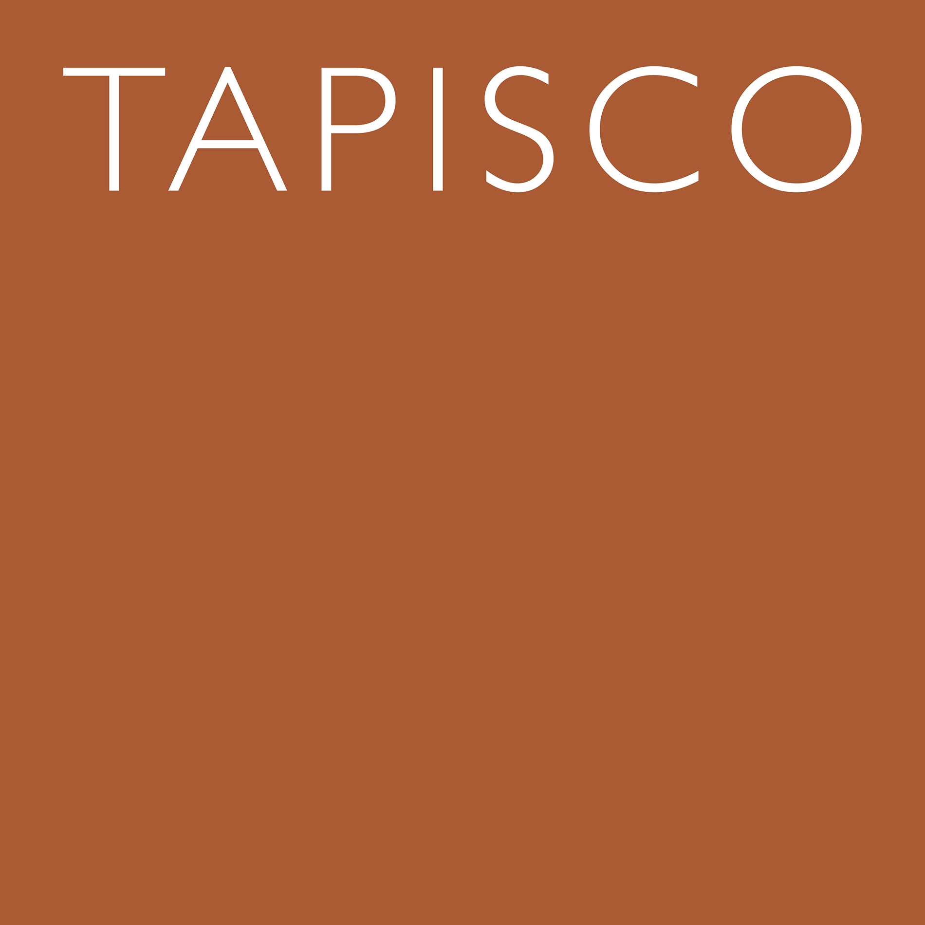


The typeface and spacing highlight the modern take on Spanish-Portuguese cuisine


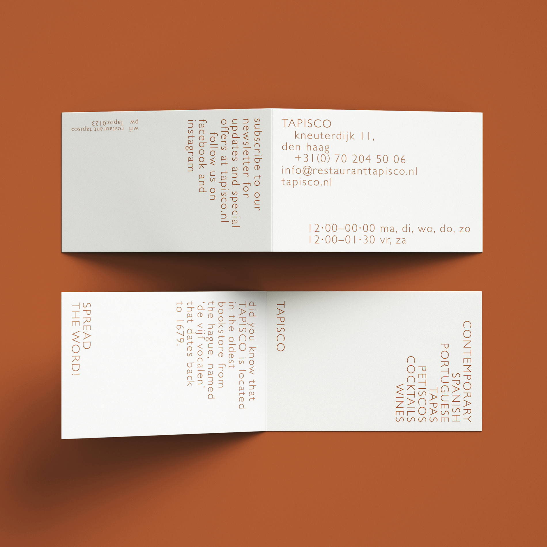
The bookmark-shaped card nods to the site's bookstore past of 1679


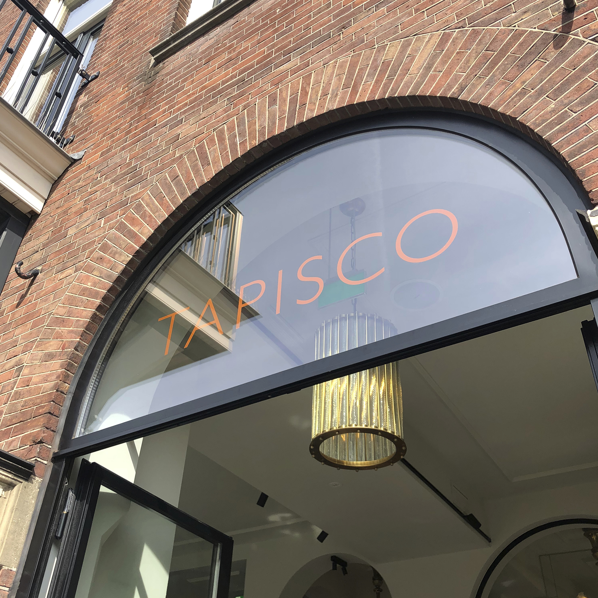
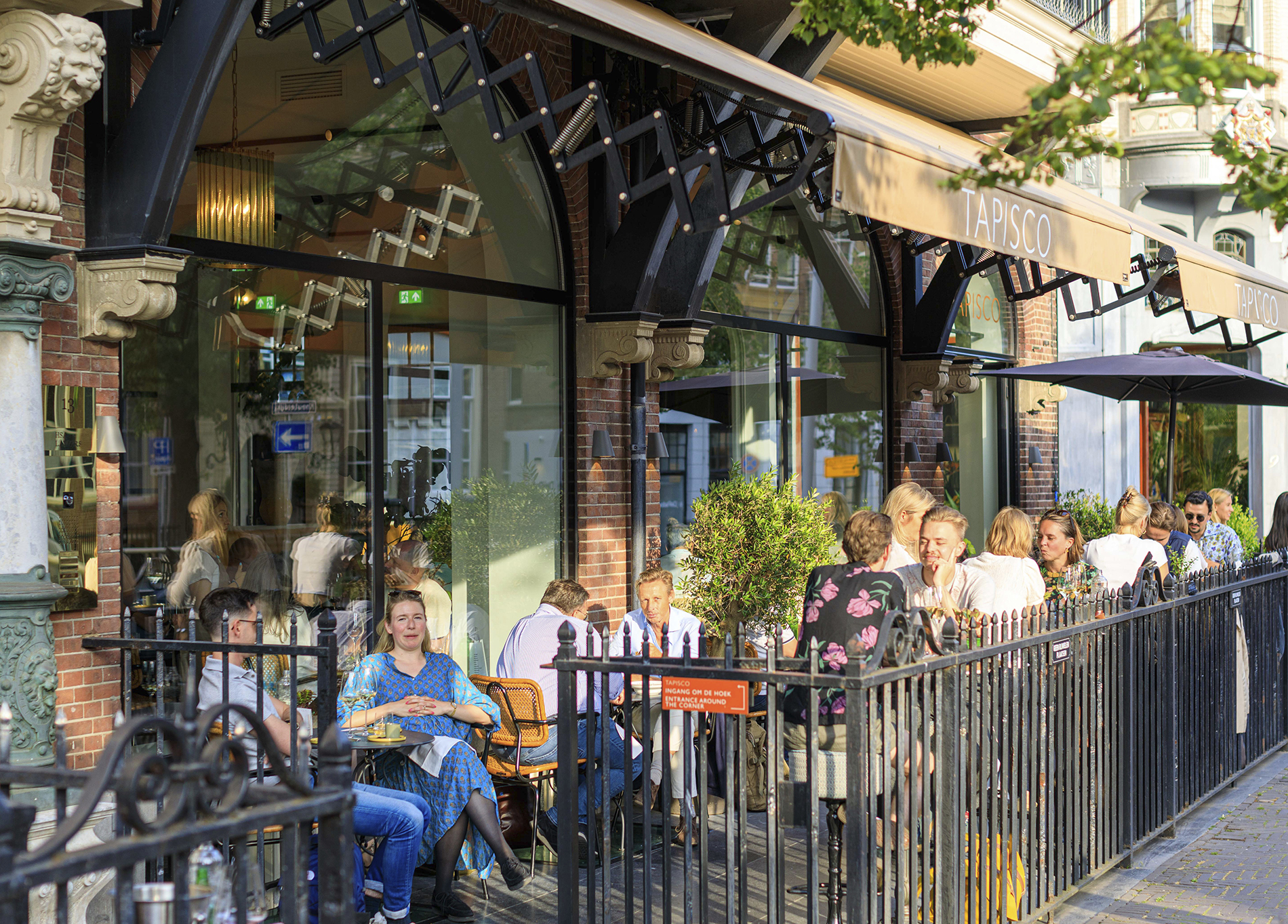
Tapisco is a contemporary yet classic Bib Gourmand awarded Spanish Portuguese inspired restaurant in the city center of The Hague. The visual identity is mainly it’s typography, a classic typeface spaced wide, that gives it a contemporary look. As the logo is all capitals, the rest of the identity is all lowercase type, to create a calm atmosphere. The warm orange color derived from the warm climate, tomatoes, chorizo, croquetas, empanadas and sobrasada.
The identity is mainly it’s typography. By choosing to make a clear distinction by designing the logo in capitals, and consistently use lowercase for all other communication, we create a contrast that strengthens the brands experience.
Photography by Cavado