


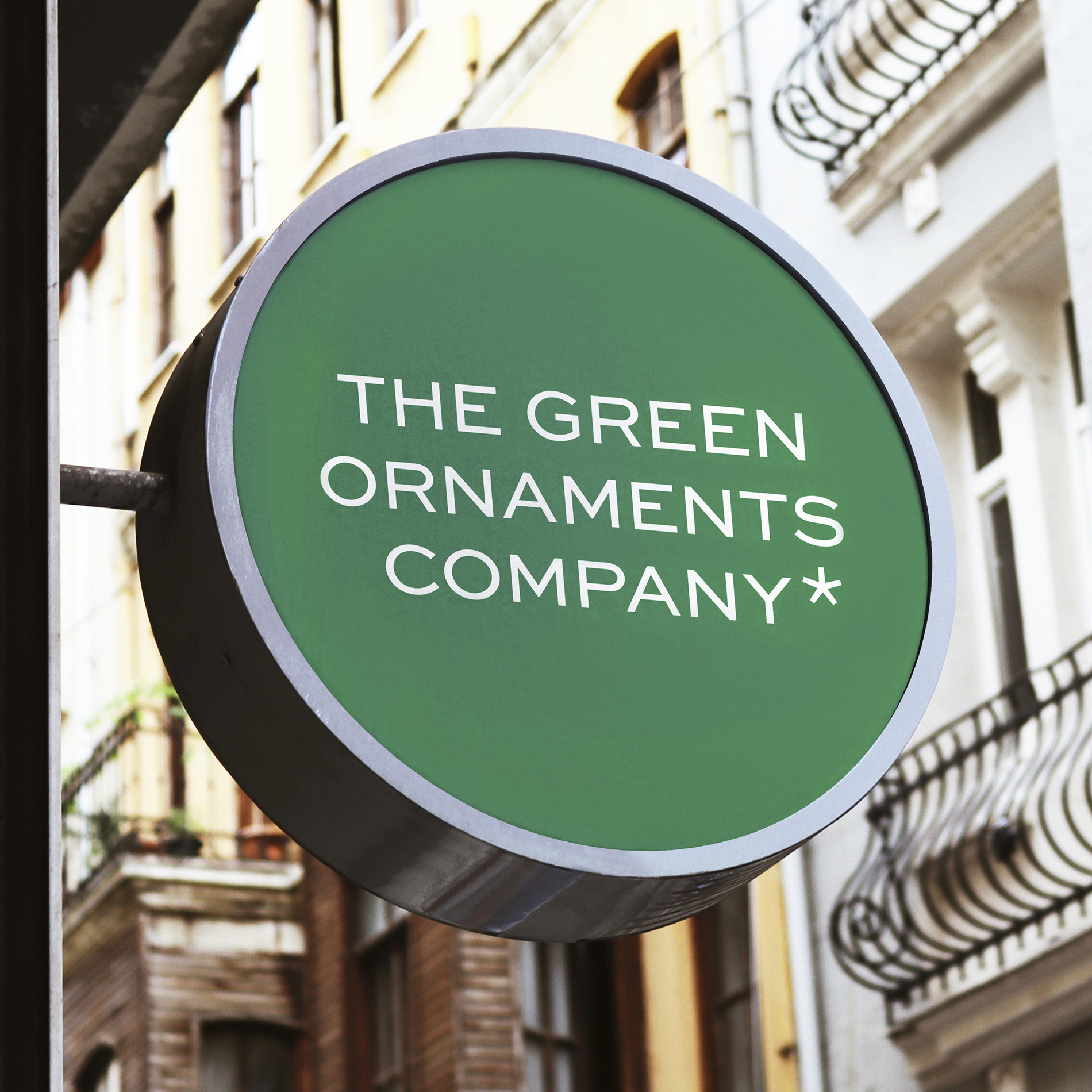

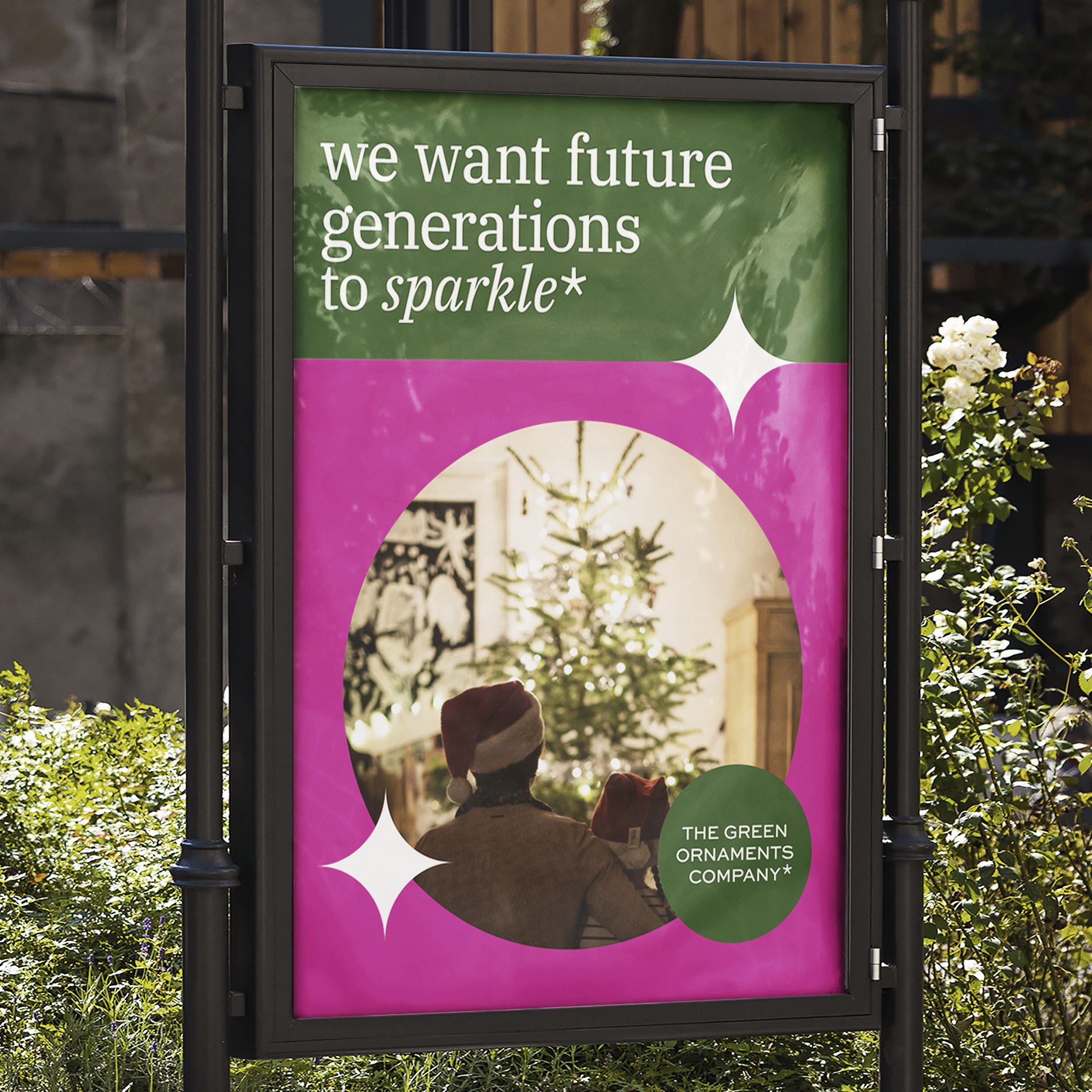
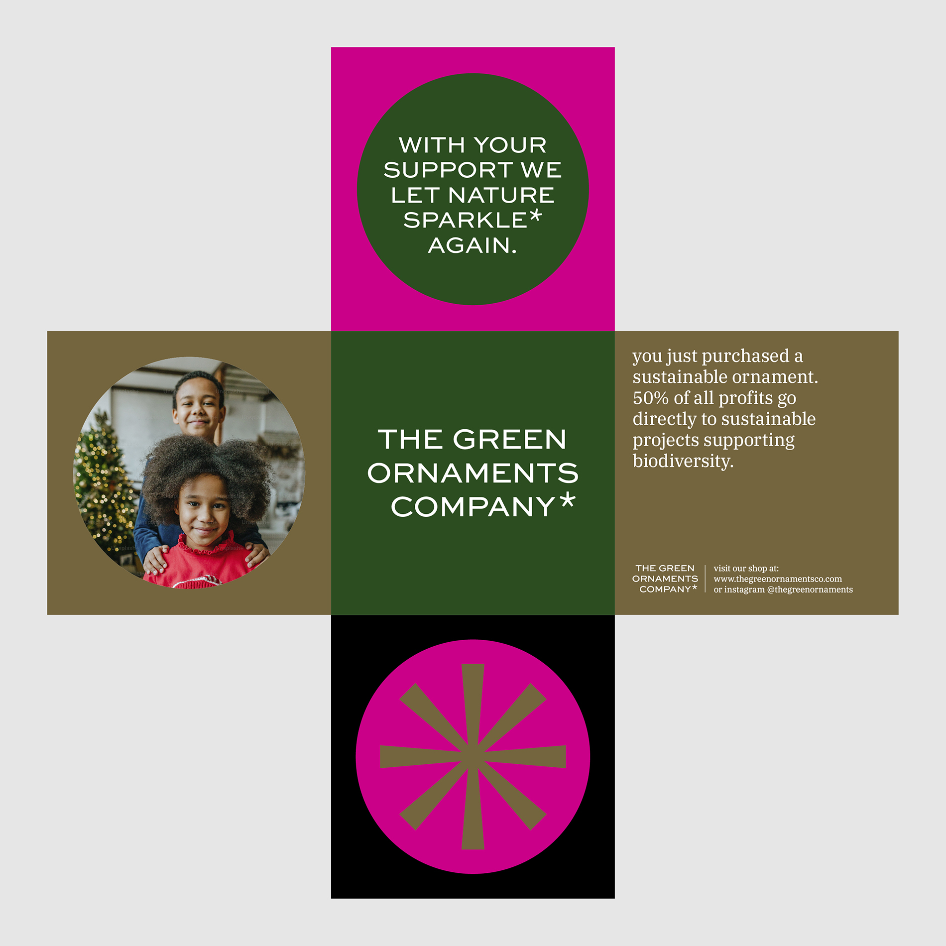
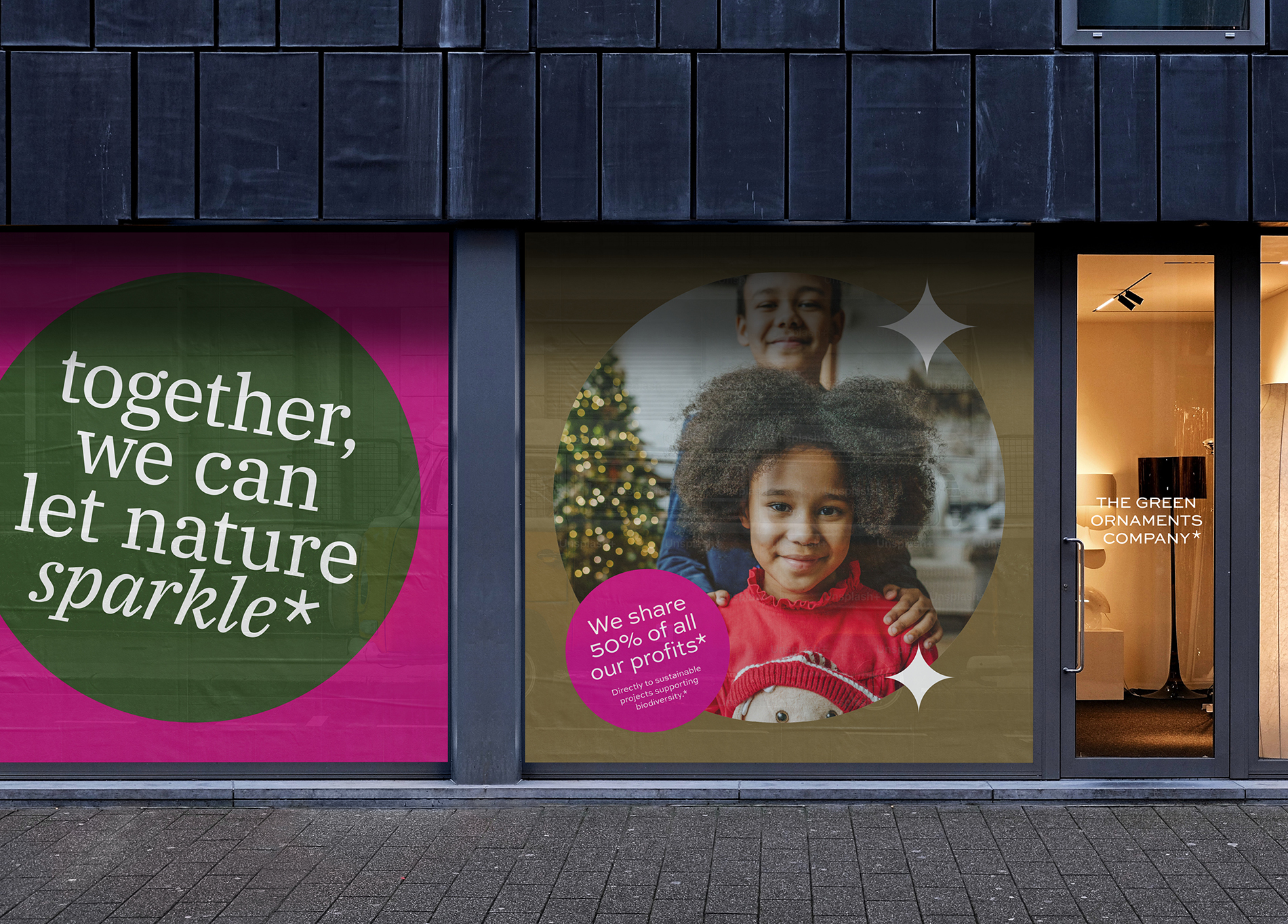
A key feature of the identity is the asterisk


Each celebration is paired with its own unique color DNA

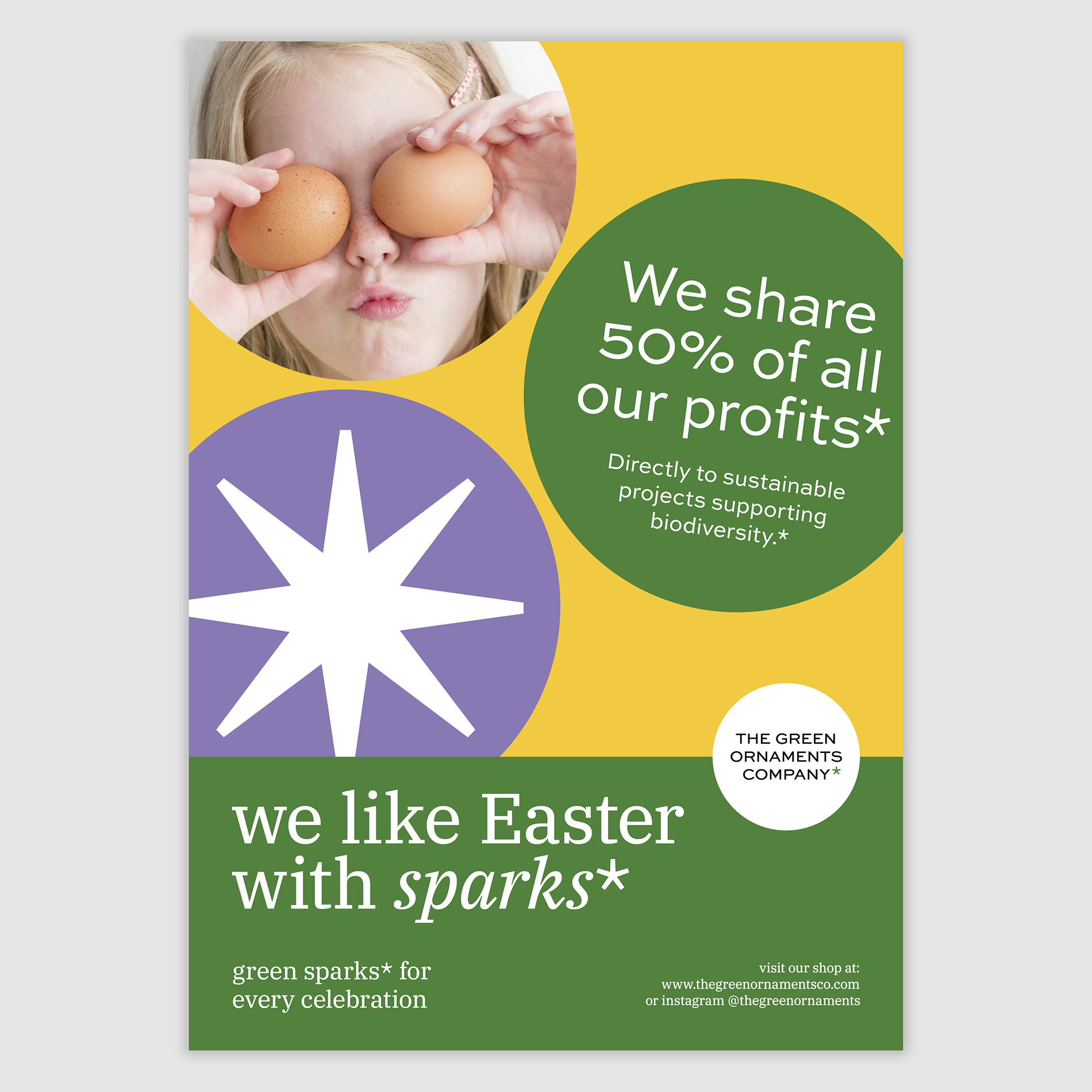
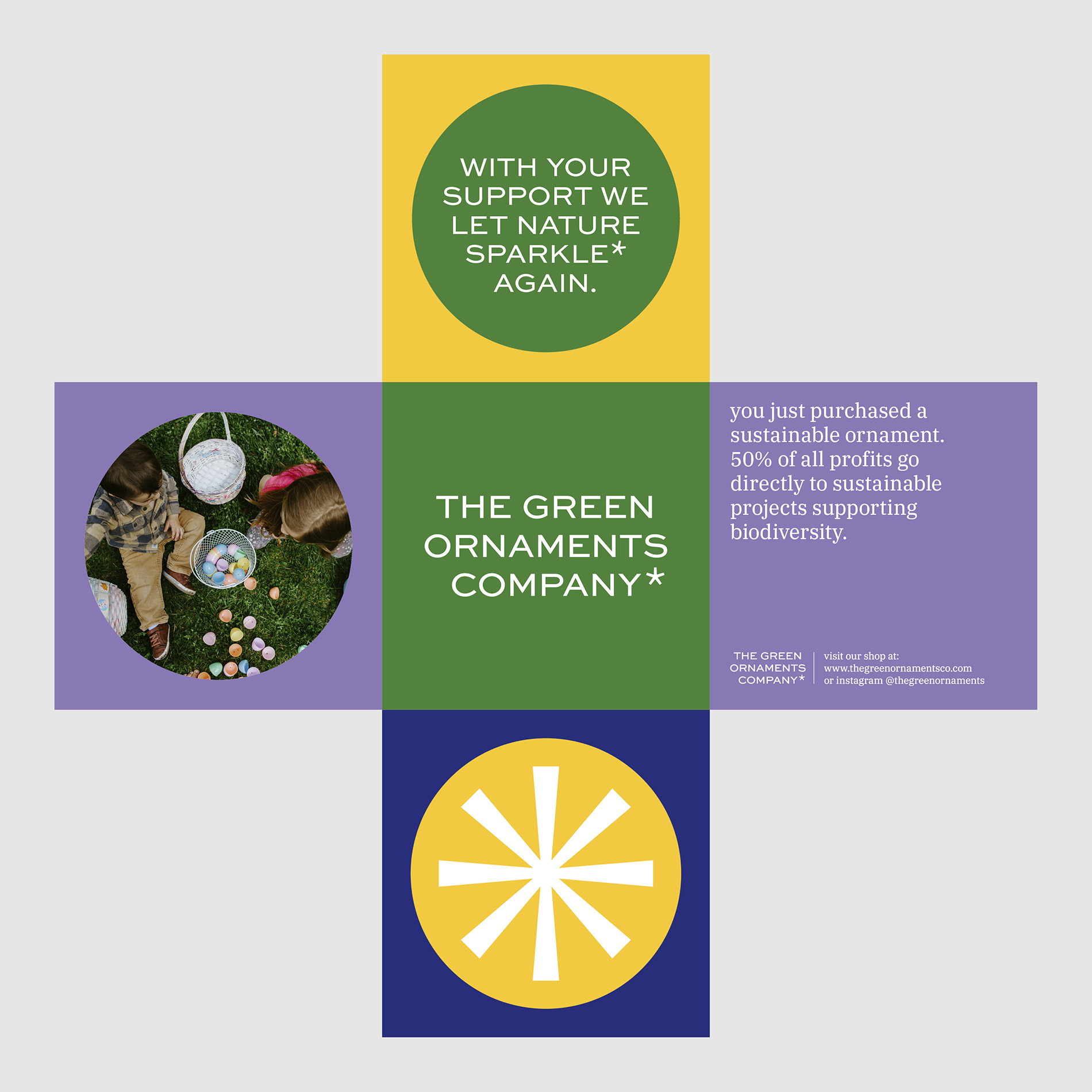
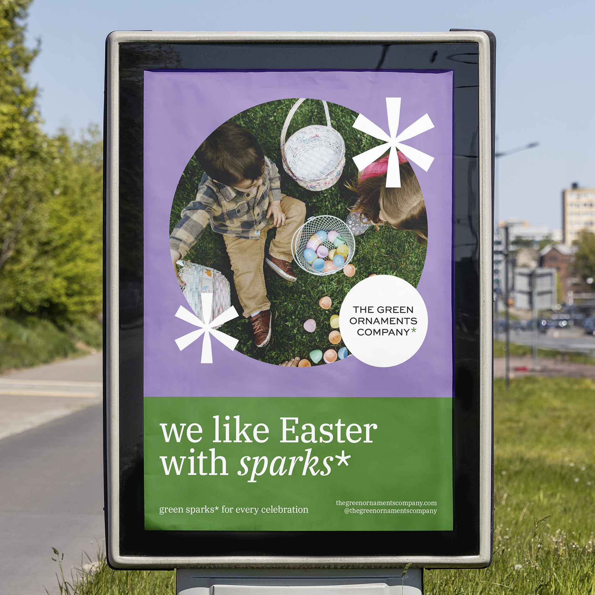

The Green Ornaments Company is dedicated to finding sustainable ways to celebrate. Its visual identity and branding bring together the spirit of celebration and environmental responsibility. A key feature of the identity is the asterisk, which functions both on a visual and a communicative level.
The primary typeface is playful yet commercial, conveying the brand’s core message while allowing space for vibrant colors and atmospheric imagery. A complementary serif font adds a warm, inviting undertone that tells the story.
The foundation of the visual identity lays in a warm green color, from which a range of green variants—lighter or darker—are derived to suit different festive themes. Each celebration is paired with its own unique color DNA, adding individuality and richness to the overall identity.