

We focused on creating a visual language that evokes the feeling of carefully organized lists


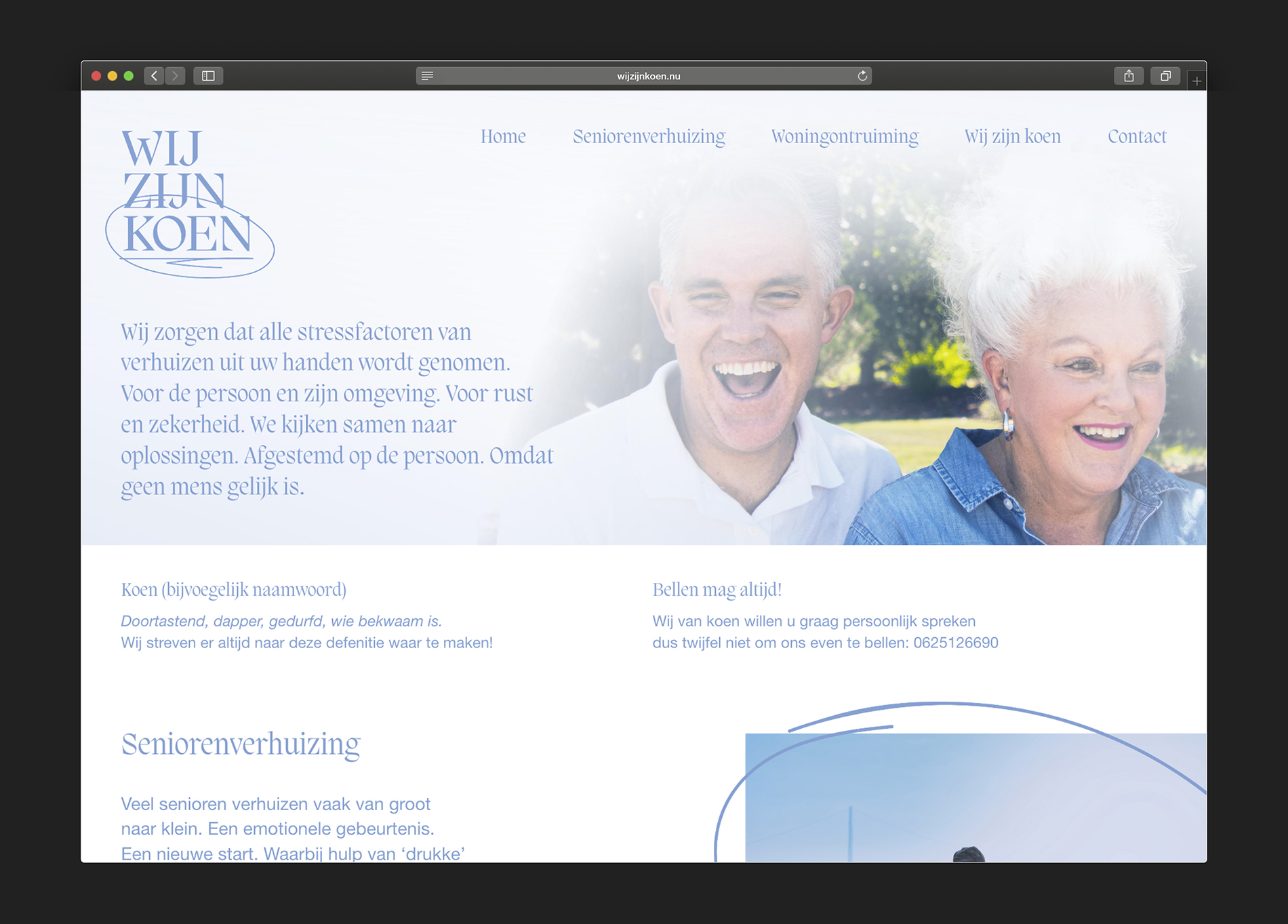
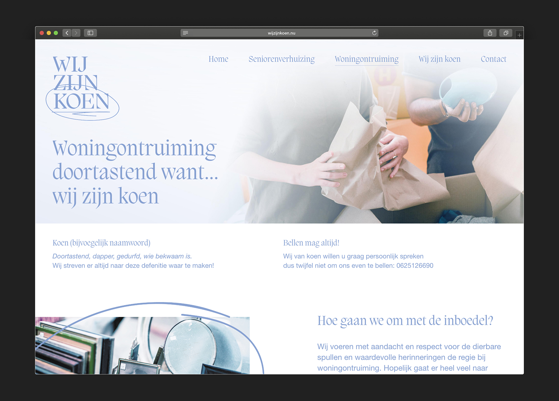
The color blue gives the identity a calm presence, in relation to a often stressful event in life


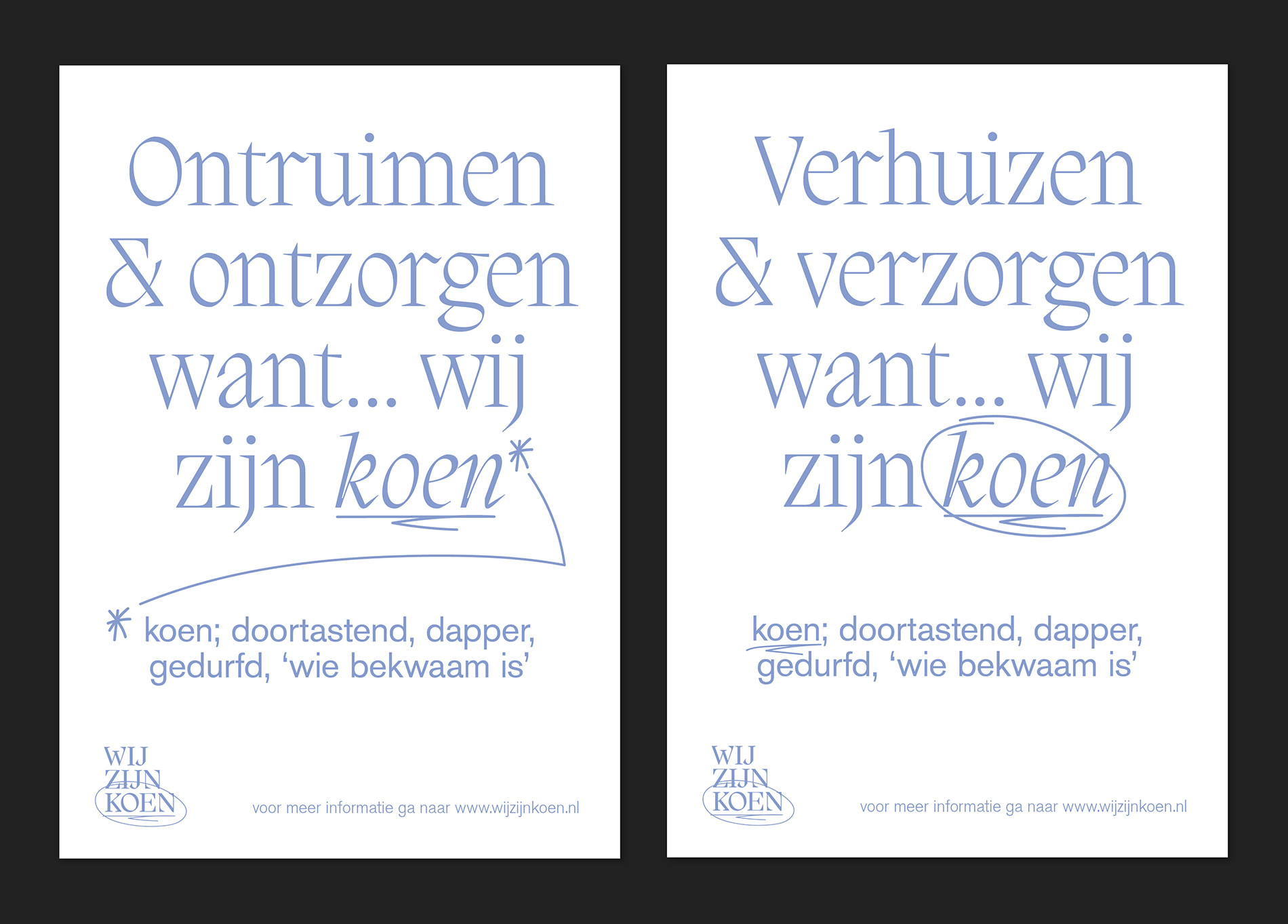
For Wij Zijn Koen, the goal was to transform the often overwhelming process of moving into a well-organized experience. The identity we designed starts around the concept of planning and control. We focused on creating a visual language that evokes the feeling of carefully organized lists—an essential tool for any successful move.
The use of circling important items, crossing off tasks, and highlighting milestones in the design reflects the core concept of moving through steps methodically. The color blue gives the identity a calm presence, in relation to a often stressful event in life.
Every detail in the branding was chosen to reinforce this feeling of efficiency and ease, ensuring that every part of the moving journey—from preparation to execution—feels clear and manageable.
In collaboration with Nanneke Boomgaard

